What I Learned about Painting Roads from Robert Genn
 Robert Genn and the Art of the Road
We explored atmosphere through the vivid, tape-masked work of Michael O'Toole — a painter who could make you feel mist on your face and sun on your skin. It was a powerful lesson in how atmosphere creates depth, emotion, and a sense of place.
In this article, we stay in that spirit of discovery as we turn our attention to a different kind of depth — compositional depth. And there is no better teacher for this than the artist who was one of my very first instructors: Robert Genn.
First, let's talk about something that might seem simple but is anything but. What makes a road in a painting interesting?
Roads and pathways are one of the most common subjects in landscape painting. I've painted them more than just about anything else — and I realized, looking back as I put together this module, that I'd been doing them somewhat on autopilot for years. Generic, swoopy, a little boring. Some of those paintings were actually quite nice, but the roads were just... roads.
What Robert Genn taught me — and what you'll feel immediately when you study his work — is that a road has a job. It leads your eye in. But how it leads your eye in is everything. A road that hides behind a hill. A bend you didn't expect. A destination that's just barely visible, a little shrouded, a little mysterious. That's not just a road anymore. That's an invitation.
What is around that corner? What will I find when I go on this road trip? There's an element of adventure in it — and that's what we love about roads in painting.
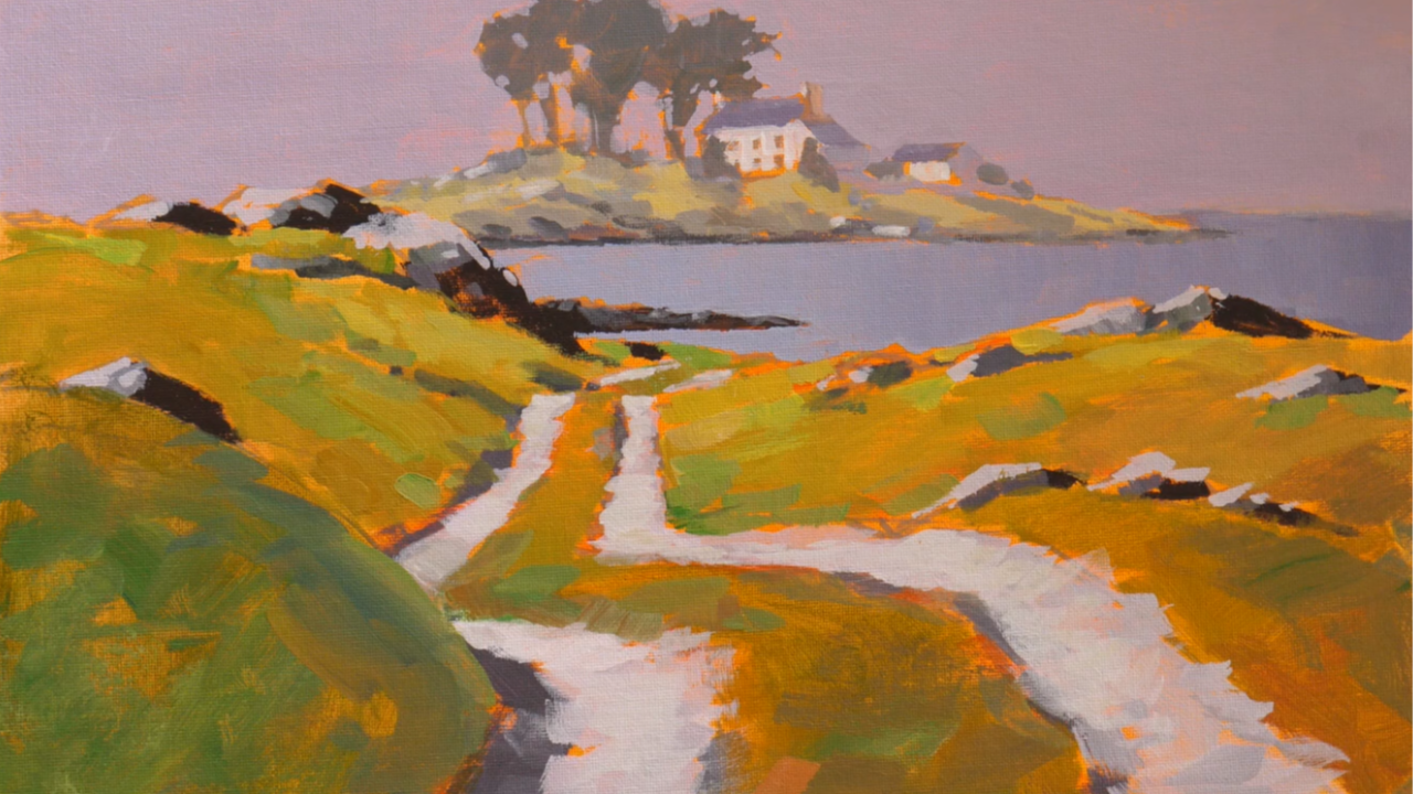
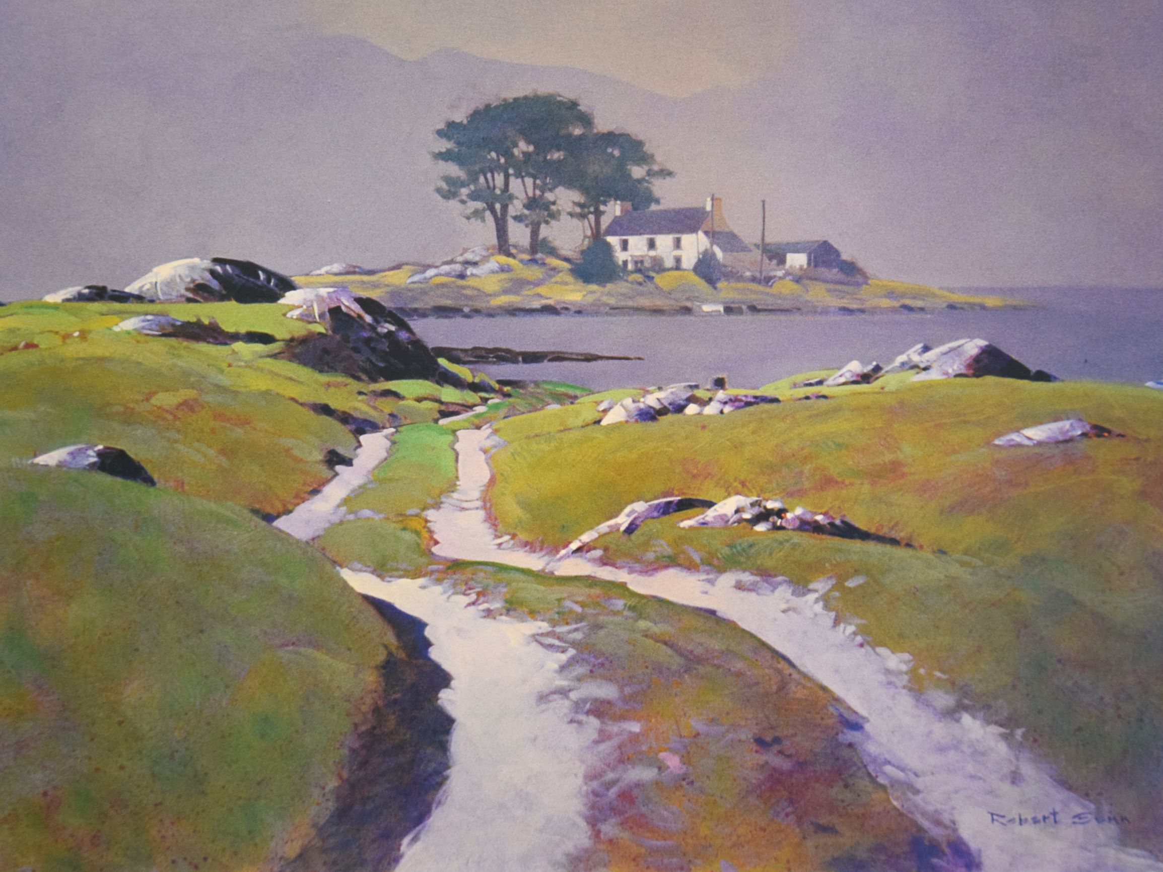
Robert Genn understood this deeply, and his painting of a road in Ireland (yes, Ireland!) is the perfect example of it.
What I Learned
Studying this master copy taught me several things I carry with me every time I pick up a brush:
1. Roads should disappear. One of the most powerful things Genn did in this painting was let the road hide behind a section of hill. You don't see the whole thing at once — it bends, it dips, it reappears. That mystery is what makes a viewer lean in. If you can see every inch of the road, there's nothing left to wonder about.
2. Gray is where the eye rests. This one surprised me when I first learned it from Robert. He used grays masterfully — and not just one gray, but dozens of different grays, warm ones and cool ones, throughout the painting. He described gray as a place for your eye to rest, and once I understood that, I started seeing it everywhere in great paintings. It's the quiet between the notes.
3. Gradations create believability. A gradation is where color shifts gradually as it moves across a surface. Robert taught me this concept early in my training, and you can see it everywhere in this painting — the grass getting lighter as it approaches the horizon, the water shifting from darker to lighter, the background colors growing more muted and hazy the further they recede. This is atmospheric perspective in its subtlest form, and it's what makes a painting feel real.
4. Know where your light is coming from. In this painting, the light is coming from one consistent direction — you can tell by how the shadows fall on the rocks. Genn never confused the viewer. Every highlight, every shadow tells the same story about the sun. When the light source is unclear in a painting, viewers feel it even if they can't name it. It unsettles them. Consistency builds trust.
5. Detail is seasoning, not the meal. Near the end of the demo, I shared a quote from artist and instructor Bill Reese — a man my father knew, and someone our own Dianna Shyne studied under. He said: detail is like seasoning. A little seasoning adds tremendous flavor, but you would never make a meal out of seasoning alone. That idea perfectly captures what Genn was doing in this painting. Small, selective details that make everything feel just believable enough. Nothing more.
These principles work together to create a painting that feels lived-in and true — one that invites you to step onto that road and see where it leads.
And here's a funny story Robert tells about this very painting. When the work sold to a collector, Robert had written the general location on the back of the canvas — the painting was set in Ireland. The collector actually traveled to that spot and found the exact location. He came back and reported to Robert that he had gotten the greens wrong. Isn't that the best? That's the kind of thing that only a truly great painting could inspire someone to go find out.
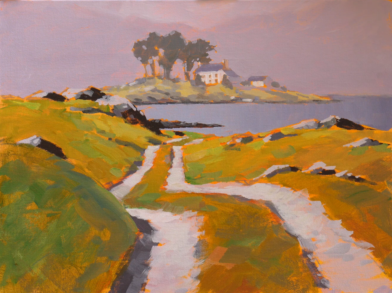
My demonstrated copy of Robert Genn's "Below the Twelve Bens"
More about Robert Genn:
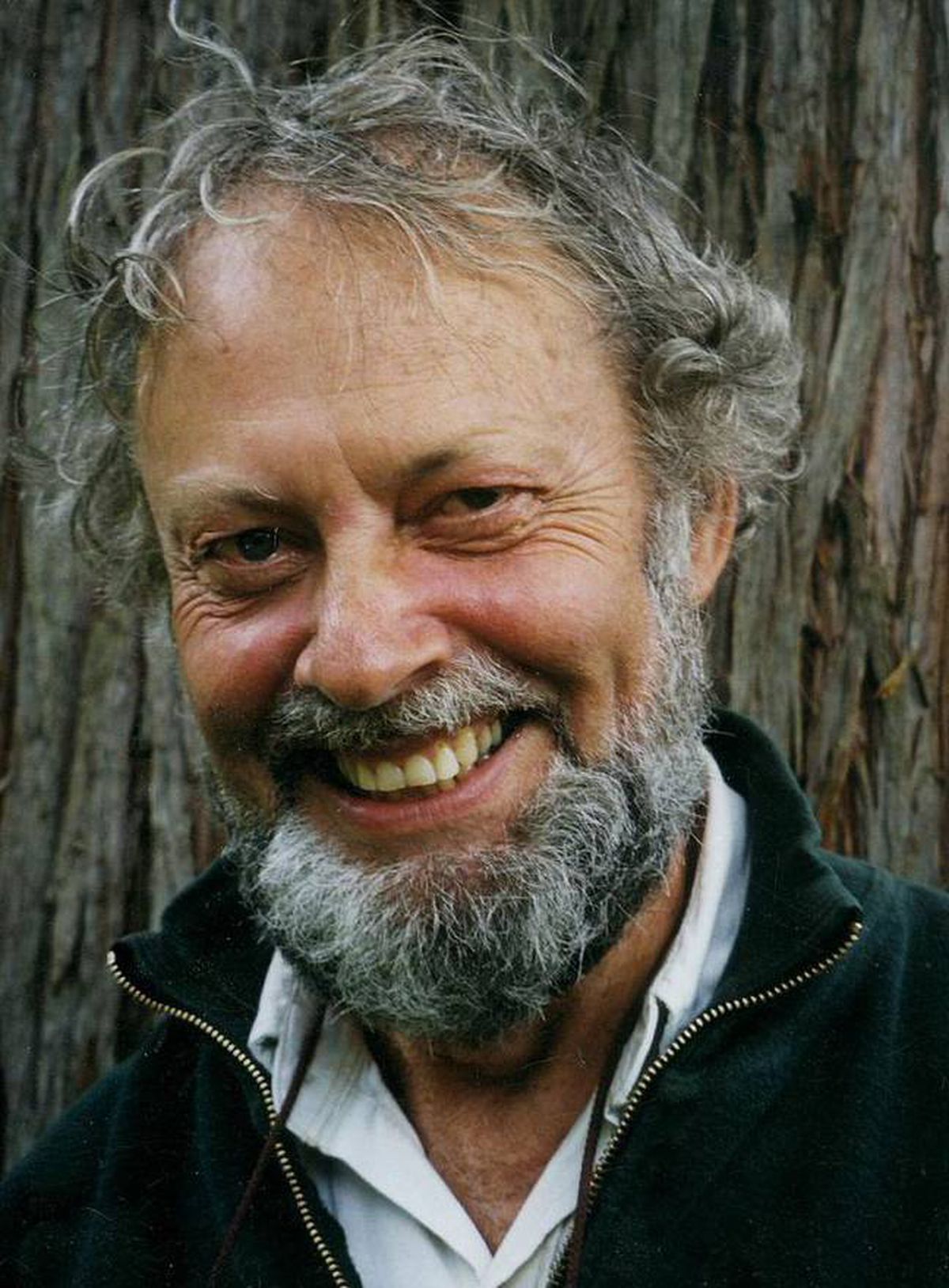
Robert Genn was a Canadian artist, writer, and educator — and one of the most generous art teachers of his generation. He was beloved not only for his paintings but for his thoughtful, twice-weekly letters on the creative life, which he sent to thousands of artists around the world and which continued to circulate long after his passing. His landscape work is known for its subtlety, its sophisticated use of color and value, and its quiet emotional weight — a style he described as a balance of intuition and craft.
He was one of my earliest teachers, and it was from Robert that I first learned to use gray intentionally, to think about gradations, and to look at a scene not just as a subject but as a design problem. His influence runs through everything I do.
Robert Genn passed away in 2014, but his work — and his words — continue to shape painters all over the world. It was a joy and an honor to study one of his paintings and to bring some of what he gave me into the classroom.
You can access our full module on roads and compositional design by becoming an Acrylic University member! Click here for more info: https://www.acrylicuniversity.com/