Sun Drenched Trees | Full Acrylic Tutorial | For The Love Of Painting
How to Paint Sun-Drenched Trees with Golden Light in Acrylics
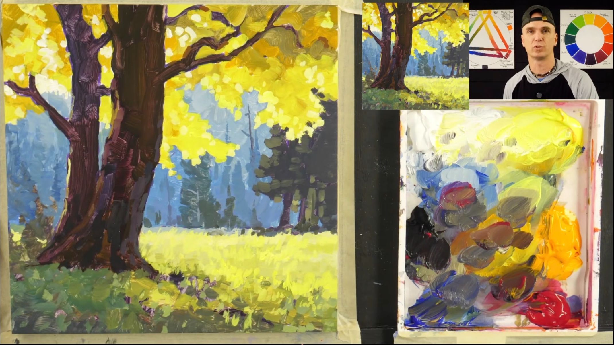
There's a kind of painting that draws me in every time: trees lit by golden afternoon light, the kind of late-summer or early-fall day where the sun feels low and the field is glowing. This tutorial walks you through that scene step by step — every technique, every brush choice, and every "why" behind the order I work in.
What supplies do you need to paint sun-drenched trees?
You don't need much. Here's the full setup:
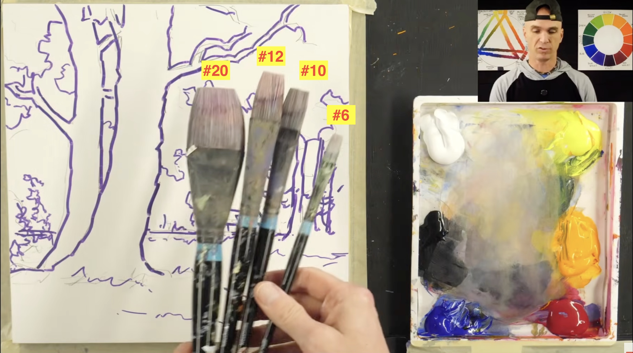
- Brushes: Flat brushes in sizes #6, #10, #12, and #20
- Paints (6 colors):
- Titanium White
- Cadmium Yellow Light
- Cadmium Orange
- Quinacridone Red
- Ultramarine Blue
- Mars Black
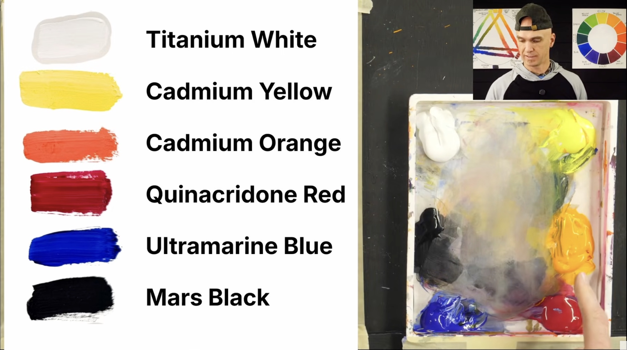
- Surface: An unprimed gesso panel (but a canvas, panel, sketchbook, or paper works just as well — don't let surface stop you)
That's it. A restrained palette makes the whole painting feel more cohesive — and forces you to actually mix colors instead of reaching for a tube.
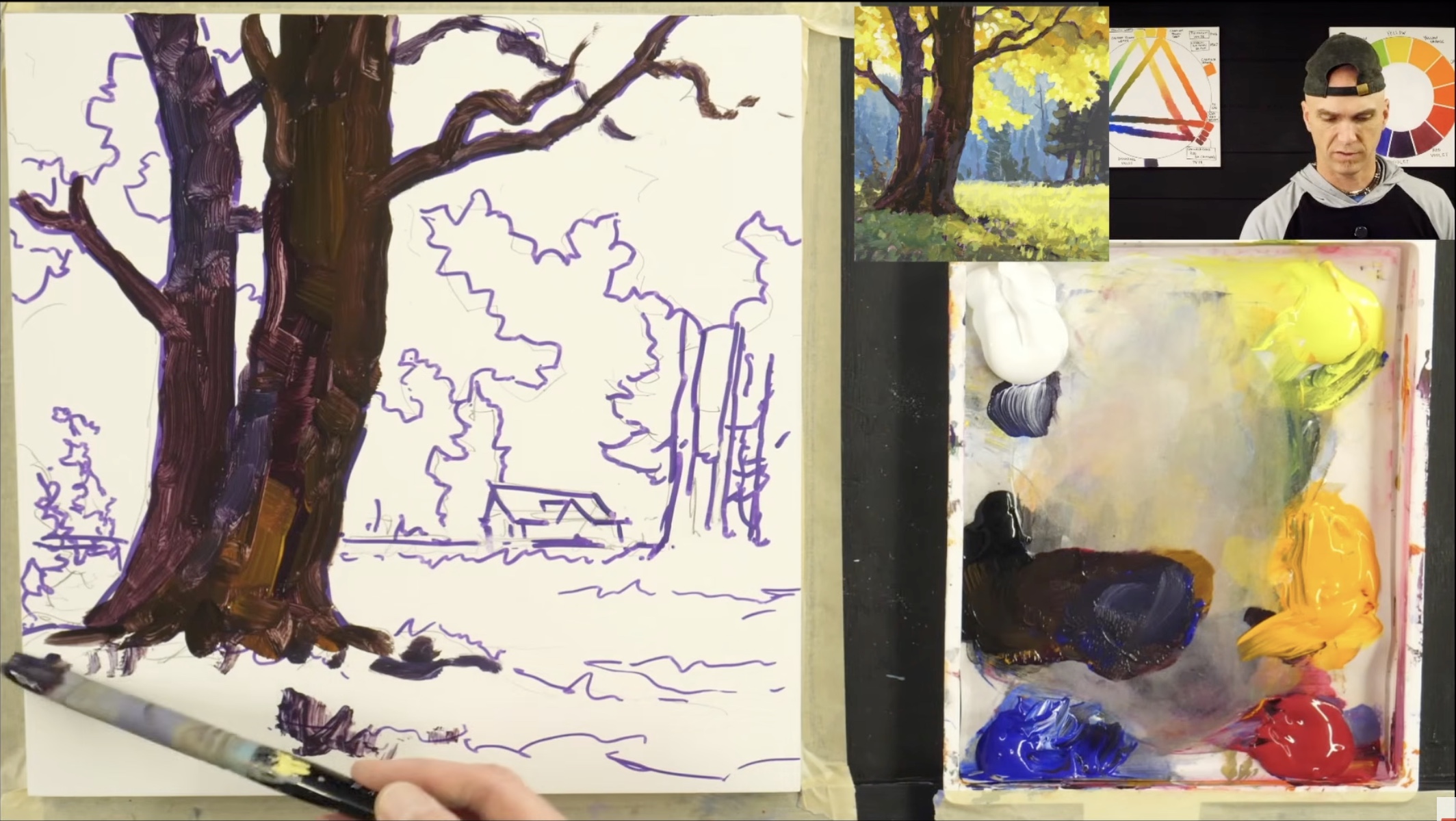
Why should you start with the darkest values first?
Starting with darks gives you a foundation to layer on top of and lets you see where your darkest darks live before everything else competes for attention.
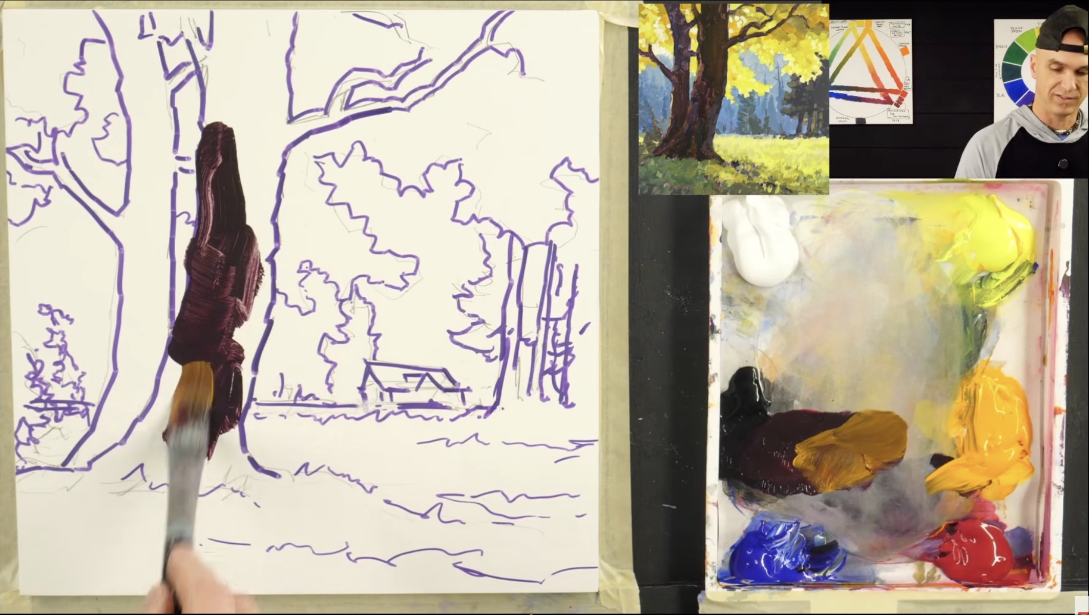
When you block in the darkest elements first — in this painting, the foreground trees — you immediately establish depth and contrast. Then as you add midtones and highlights, you're building on something, not floating colors and hoping they read correctly later.
A helpful tip: don't use mars black straight from the tube. Pure black can look dead. Mix a little quinacridone red (or any color) into your black to bring it alive. Varying your darks is one of the simplest ways to add color and depth to a painting without changing your overall design.
How do you make a black look more colorful in painting?
Mix a small amount of red, blue, or other color directly into your black on the palette. This shifts the dark slightly warmer or cooler depending on what you add — red gives a warm, almost burgundy-black; blue gives a cool, atmospheric dark. The painted black still reads as dark, but it has life inside it instead of feeling flat.
You can also mix custom blacks entirely from scratch: ultramarine blue + quinacridone red gives a deep, rich dark with no tube black at all.
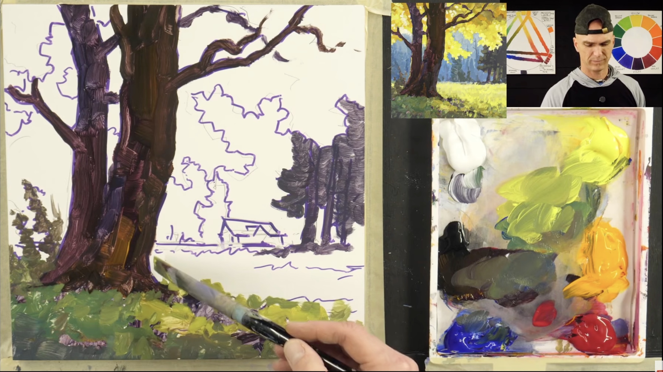
How do you paint realistic tree trunks?
Two rules:
- Trees taper as they go up. A trunk that's the same width at the base as it is near the top will look wrong even if a viewer can't say why. Make sure your trunks narrow as they rise — that's what happens in nature.
- Tree trunks are cylinders. Light wraps around them. On the side opposite your light source, you'll often see a band of reflected light — slightly lighter than the deepest shadow, picking up color from the ground or nearby foliage. Adding that subtle highlight band on the shadow side makes a trunk feel three-dimensional instead of flat.
How do you paint shadows and sunlight differently?
Shadows are cool. Sunlight is warm.
- For shadow areas (grass under trees, distant foliage, the cool side of a trunk), lean toward more blue in your mixes. Blue-greens and gray-greens read as shaded.
- For sunlit areas (the bright field, sun-hit leaves), lean toward more yellow and orange. Warmth = light.
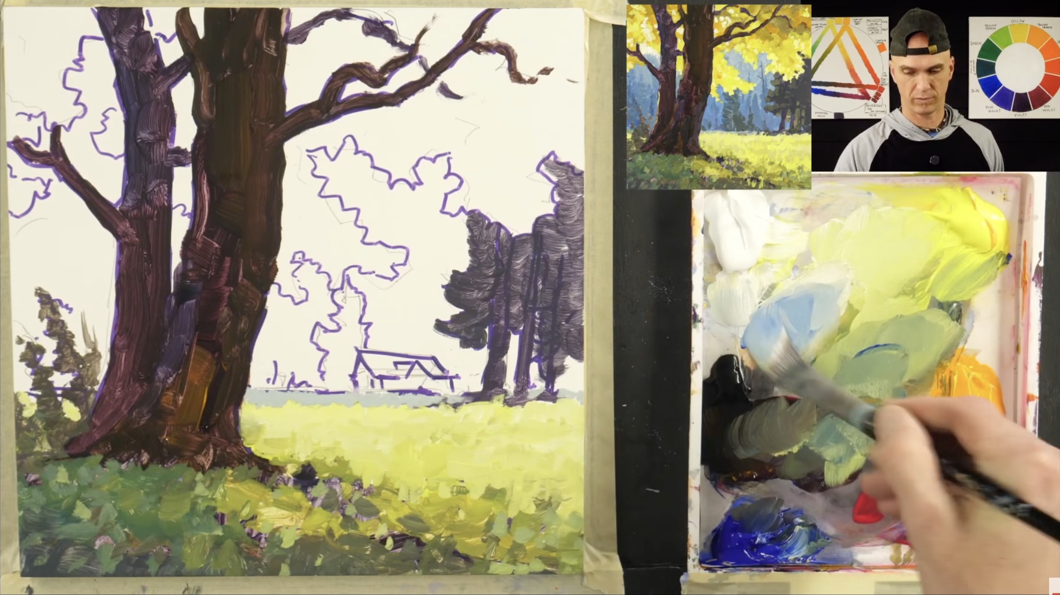
- To mute or gray down a green that feels too vivid, mix in a touch of red — red and green are complements on the color wheel, so they neutralize each other into a softer, more believable color.
This warm-cool relationship is what makes brilliant sunlight feel brilliant. The shadows are just as important as the sunlit areas — you need the contrast.
What is the "close the corner" rule in landscape painting?
If you put a really bright area in the bottom corner of your painting, it pulls the viewer's eye right out of the scene. Close the corner by darkening the bottom edge or adding shadow shapes there. This keeps the viewer's attention higher up in the painting where the real action is.
It's a small move with a big payoff for composition.
Should you paint the foreground or background first?
Either approach works — it's a matter of personal preference. In this tutorial I painted foreground first because it's what I'm used to and I like how it looks in the end. But painting background-to-foreground is actually easier in many cases, and I'd recommend trying both.
The order isn't a rule. Your values, edges, and color relationships matter far more than your direction of attack.
How do you create depth and atmosphere in a landscape?
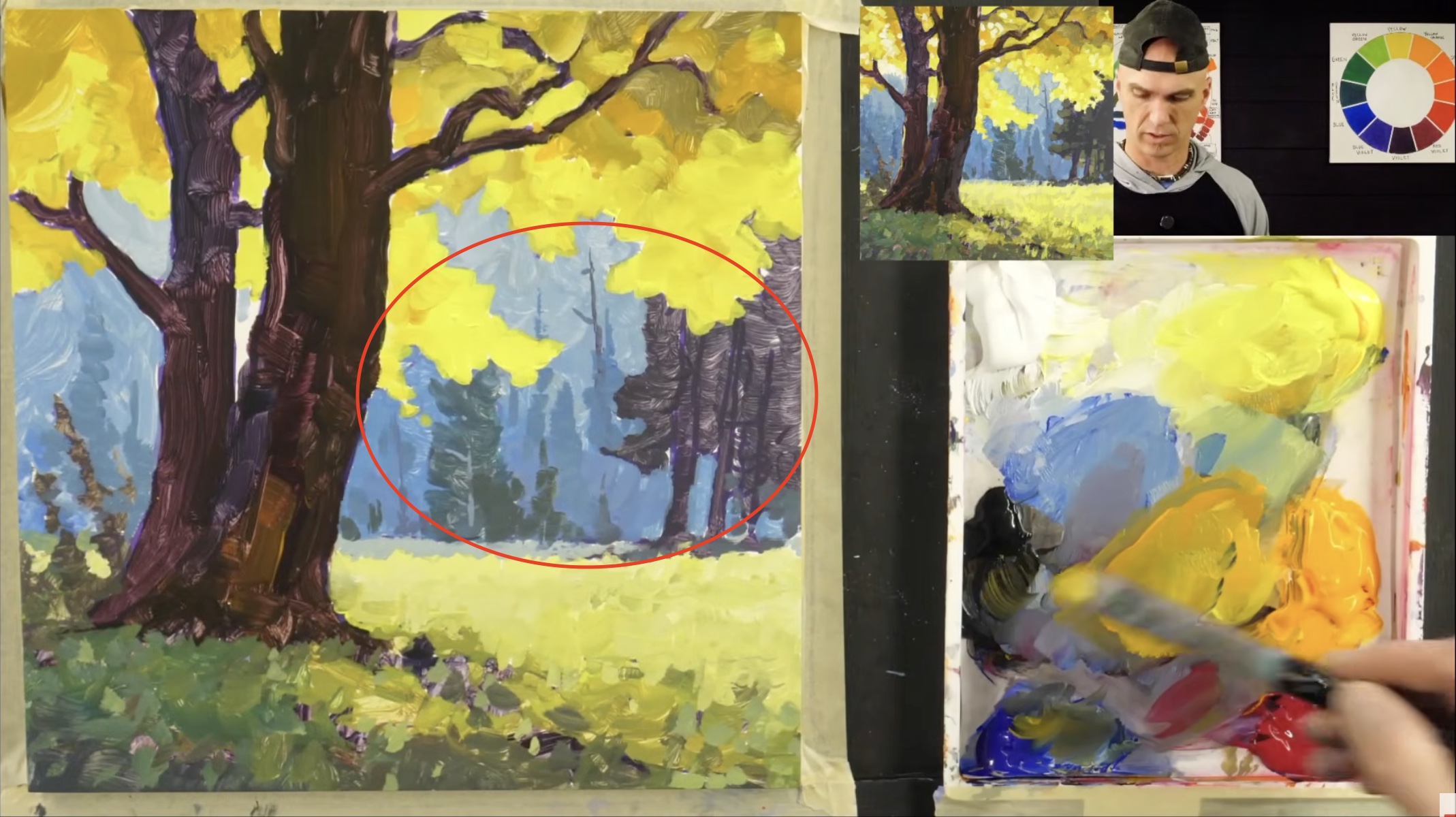
Push distant elements cooler and bluer. Background trees, faraway hills, and shadowed areas in the distance should have more blue mixed in than your foreground equivalents. Closer leaves catch more direct light, so they read as warmer and more golden.
This is called atmospheric perspective — and it works because that's actually how the air affects color in real life. The more atmosphere between you and an object, the more blue and muted it appears.
How do you fix mistakes in acrylic painting?
Acrylics are forgiving. If you put paint somewhere you didn't mean to:
- Wipe it off quickly with your finger, a paper towel, or a rag if it's still wet
- Let it dry and paint over it if it's already set — acrylics dry fast enough that you can recover within minutes
- Mix a matching color and patch it like the mistake was never there
You can fix just about anything with a couple of brush strokes. Never get despondent over a "mistake" — they're part of the process, not a failure of it.
What does it mean that "art is being a magician"?
You're trying to convince someone they're looking into a three-dimensional world when really they're just looking at a two-dimensional painting. That's the trick of painting. Every value relationship, every soft edge, every warm-cool shift is there to sell the illusion of depth, light, and air.
Once you start thinking of yourself as a magician — not a copier — your work changes.
Why is copying other artists a good way to learn?
A child learning to talk starts by copying their parents. They imitate sounds, then words, then sentences — and only after they've mastered the basics do they say something truly original. Art works the same way.
Copying a finished painting (like the reference in this tutorial) takes the translation work out — you don't have to figure out how to interpret a 3D scene into 2D, because someone already did. You can focus purely on brushwork, color mixing, and value relationships. It's one of the fastest ways to build the technical fluency you need before your own voice can fully emerge.
But it's a starting point, not a destination. Long-term, your unique artistic voice is what matters — and you can't reach it without first learning to spell the words.
Why does imagination matter in landscape painting?
Even when you're painting from a reference, never forget that your imagination is a powerful friend. Artists don't replicate photographs — anyone can do that. We create.
In this painting, I started with a house in the middle ground, then decided I didn't like it and replaced it with trees. That's the artist's privilege: you can change anything in the scene. The more comfortable you get using your imagination as part of the process, the more your artwork becomes uniquely yours.
Frequently asked questions
Do I have to use a gesso panel? No. Use canvas, a canvas panel, paper, a sketchbook — whatever you have. The surface is a personal preference, not a requirement.
Why does Jed paint foreground before background? Personal preference and habit. Background-to-foreground is actually easier in most cases. Try both and see which feels right.
What's the brightest highlight color in this painting? A near-white mix of titanium white with a touch of cadmium yellow light. That extreme value contrast between deepest darks and brightest lights is what makes the sunlight feel real.
Can beginners follow this tutorial? Yes. Watching a finished painting being built step-by-step is one of the easiest ways for beginners to learn — you don't have to translate a 3D scene, you just copy brushstrokes and absorb the value and color logic as you go.
Where can I get more acrylic painting tutorials like this? Acrylic University's full membership library includes step-by-step lessons across landscapes, skies, water, trees, and more — join here.
Final thoughts
This painting isn't just about technique. It's about getting comfortable with darks. About trusting your imagination. About fixing mistakes without panic. About showing up and practicing the basics so that one day, your own artistic voice can fully come through.
Whether you're brand new or coming back to painting after years away, remember:
- Start with your darks
- Build in layers, warm-cool, light-shadow
- Use your imagination — don't replicate, create
- You are loved. You are believed in. Happy painting.
Go make the world a more beautiful place.