How To Paint A Glowing Mountain Scene [Easy Art Lesson]
Painting Glorious Golden Light: A Mountain Scene in Acrylic
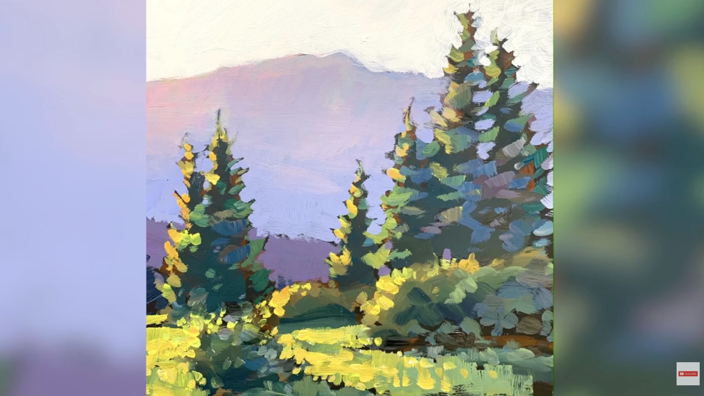
Today, I want to show you exactly how to paint a beautiful mountain scene filled with glorious golden light. It’s going to be a lot of fun—so let’s jump right in!
Starting with a Black Canvas
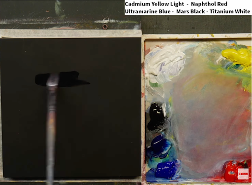
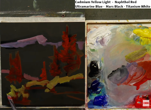
I like to begin on a black canvas. Painting on black allows me to establish a deep foundation of contrast right away. In the background, I adjusted the mountain shape slightly, giving it a stronger, more dynamic peak.
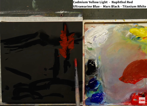
Then I began introducing color—starting with a rich, warm red. Red adds vibrancy and provides a strong contrast against the dark base.
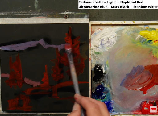
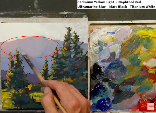
As I move further back in the design, I shift into cooler tones—bluish violets for the distant hills and mountains. At this stage, I’m setting the overall structure and composition while thinking constantly about the light. The lighting will ultimately define the atmosphere and mood of the entire piece.
Building Light and Color Contrast
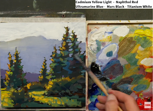
After establishing the base, I start adding in some of the initial yellows and highlights.
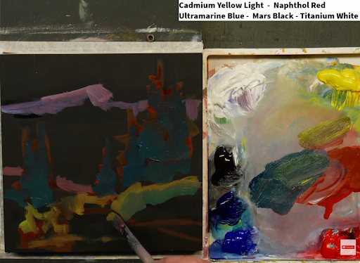
Then I bring in cooler greens, because light isn’t only about brightness and shadow—it’s also about temperature. Understanding the balance between warm and cool colors is essential for creating believable light.
In the shadow areas, even if the tones are lighter, I keep them cool—more blue-green. Where sunlight touches the scene, I shift toward warmer yellow-greens. I go back and forth between these warm and cool tones to bring depth and life to the scene. Every element—the bushes, grass, and trees—has both lit and shaded sides, and keeping track of where the light is coming from is critical.
The Power of Light
For me, light is everything. It’s the reason I paint. Whether it’s a golden hour landscape or a quiet nighttime scene, capturing that fleeting beauty of light is what makes a painting come alive.
![]()
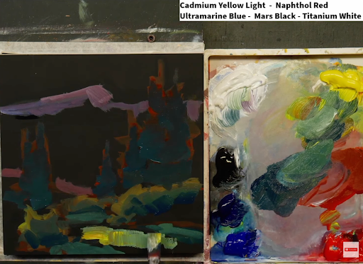
To express this, I often use subtle shimmer effects along the edges of trees and bushes—small touches of reflected light that make the scene sparkle. Notice how the right sides of the trees are cooler, while the left sides glow with warmer yellows. This shows the interplay between direct sunlight (warm) and reflected light (cool).
Working from Foreground to Background
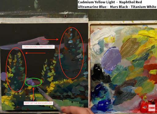
You might notice that I painted the foreground first. That may seem unusual, especially if you come from a traditional or watercolor background where the background is painted first. I completely understand the hesitation—I was trained in watercolor myself. But one of the unique advantages of acrylics is flexibility. Acrylics allow me to layer light over dark and move back and forth between areas.
This method of painting the background after the foreground completely changed how I approached acrylic painting. It opened up new possibilities for creating luminosity and atmosphere that aren’t possible in watercolor.
Adjusting the Scene
Once the main elements are in place, I look back at the reference and make refinements. For instance, I realized the left side of the mountain needed more warmth to reflect the sunlight streaming through. After adding the sky, I returned to the background hills to infuse them with a touch more golden warmth so they’d harmonize with the glowing light in the foreground.
I continue refining the foreground trees, enhancing reflected light and subtle form without losing their dark value structure. Maintaining the correct range of values is essential—if you jump too quickly from dark to mid-tone, you can lose the strength of your composition.
Layering and Gradation
When painting light over a dark canvas, multiple coats are often needed for your brightest highlights. I mix in a pink-violet hue to create a soft gradation that suggests light fading gently across the surface. This technique not only shows direction and warmth but also adds a sense of atmosphere to the whole piece.
Join the Journey: Paint Across America
If you love this kind of painting, I’d love to invite you to join my Paint Across America Challenge—52 paintings in 52 weeks. Each week, you’ll get a new beautiful landscape painting lesson packed with the techniques and insights I’ve learned over the years.
Many people set their art aside because life gets busy—but it’s never too late to start again. I’m here to help you grow and succeed.
You can sign up at PaintAcrossAmerica.com, or text me at 425-400-2094 for the link.
Don’t wait—join the journey today. Let’s paint something beautiful together!