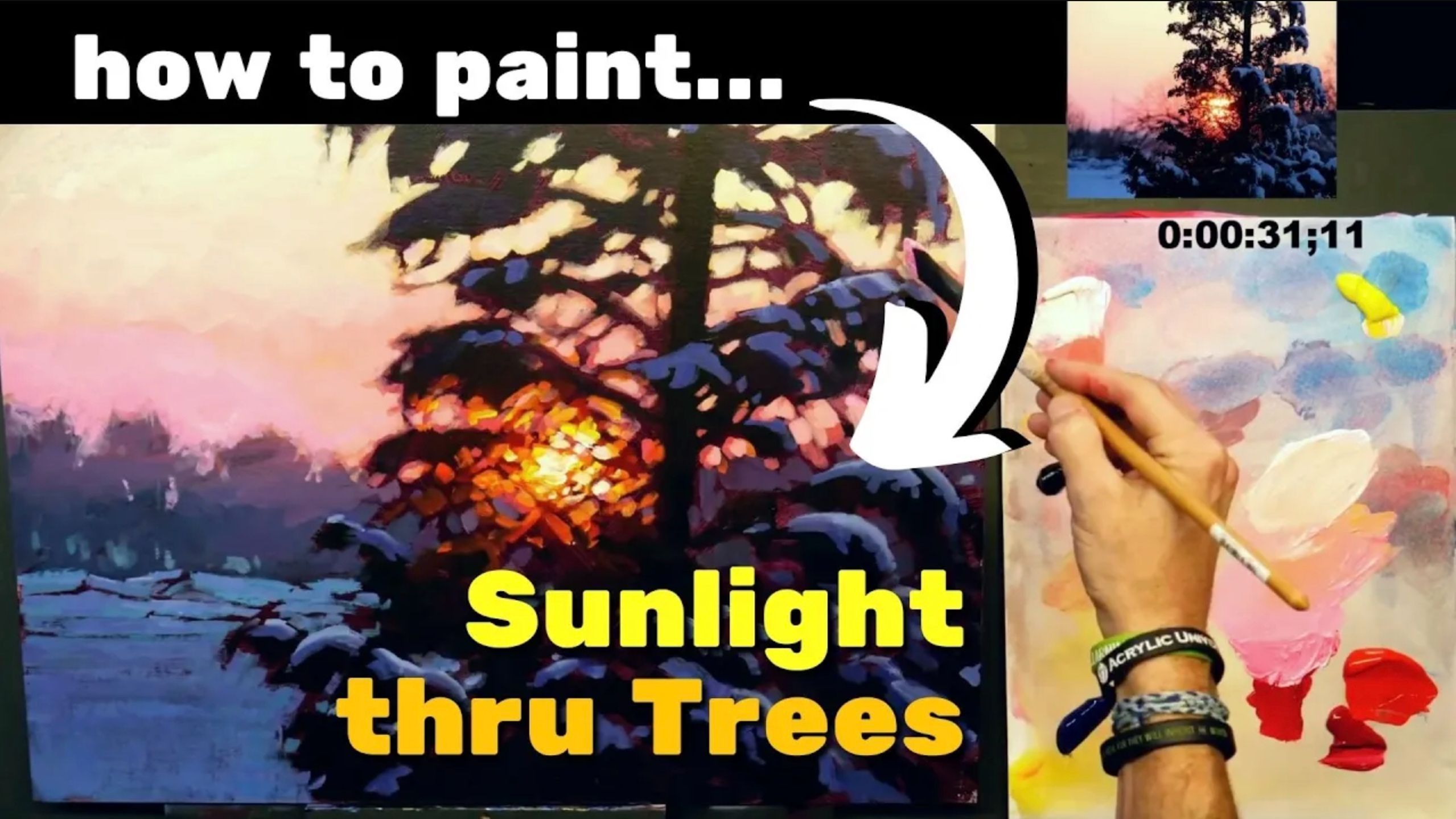
Acrylic Painting Tutorial: How To Paint Sunlight Thru Trees

Light, Light, Always The Light...
When people ask me what I like to paint, I always give the same answer: "Light."
The subject itself could be almost anything - a road, a farm, a river, an alley, a garbage can, a mountain - that part really doesn't matter to me. It's how the light is affecting the scene that interests me. Light can transform the scene, making virtually anything a potentially great subject for a painting.

A Beautiful Contrast
So when I came across this gorgeous scene with the great contrast of the warm light and cool snow and shadows, I was excited to paint it. But how can we achieve this beautiful effect in our paintings? How can we portray a sunburst where the light radiates thru a subject, or just around the edge of an object and creates a glow?
In this article, I'll walk you through my thoughts and the process I use to create a light-filled, radiant painting.
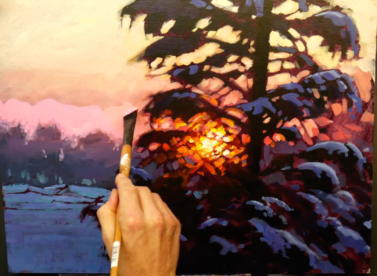
Step 1: Establish the Darks...
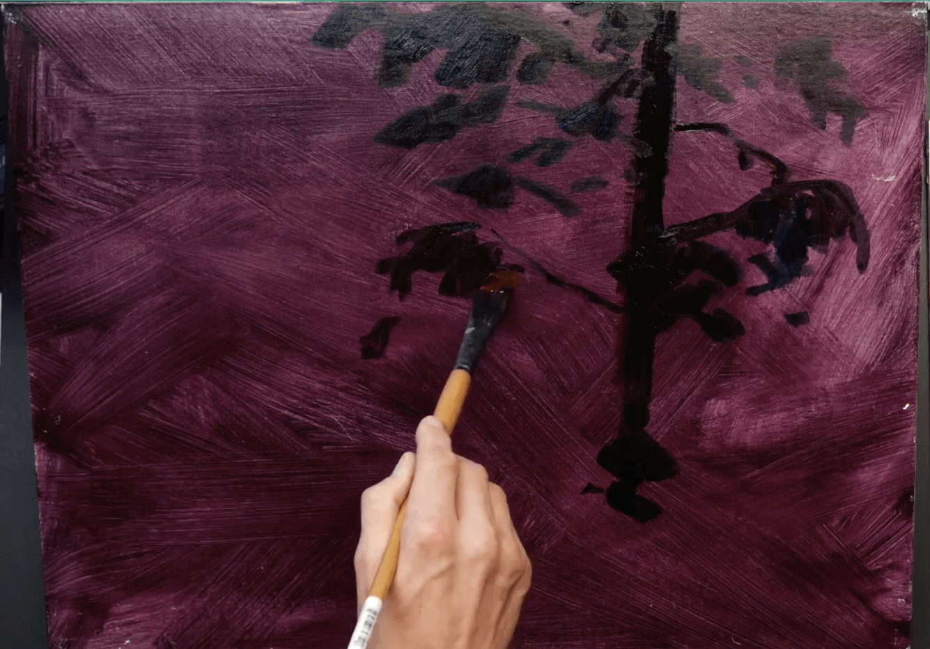
To paint vibrant light, you need to start with your darks. It is what sets the stage for the light to shine.
In this painting, I started with a dark-toned canvas. It is a violet mixture, simply made of a blue and red and applied quickly and not-too-thick. To me, what's important is not the exact colors used, but just getting the canvas covered with a color that will be fairly dark and yet still show the deeper darks of the tree.
I am "drawing" the main part of my subject - the tree - with a mix of Mars Black and a small amount of Naphthol Red. This keeps the black more colorful and alive. I'm concentrating on the basic shape of the tree and where the darkest values are.
...And The Sunburst (Step 1 Continued)
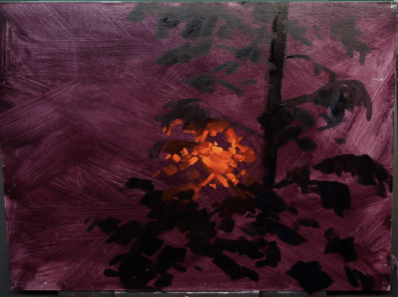
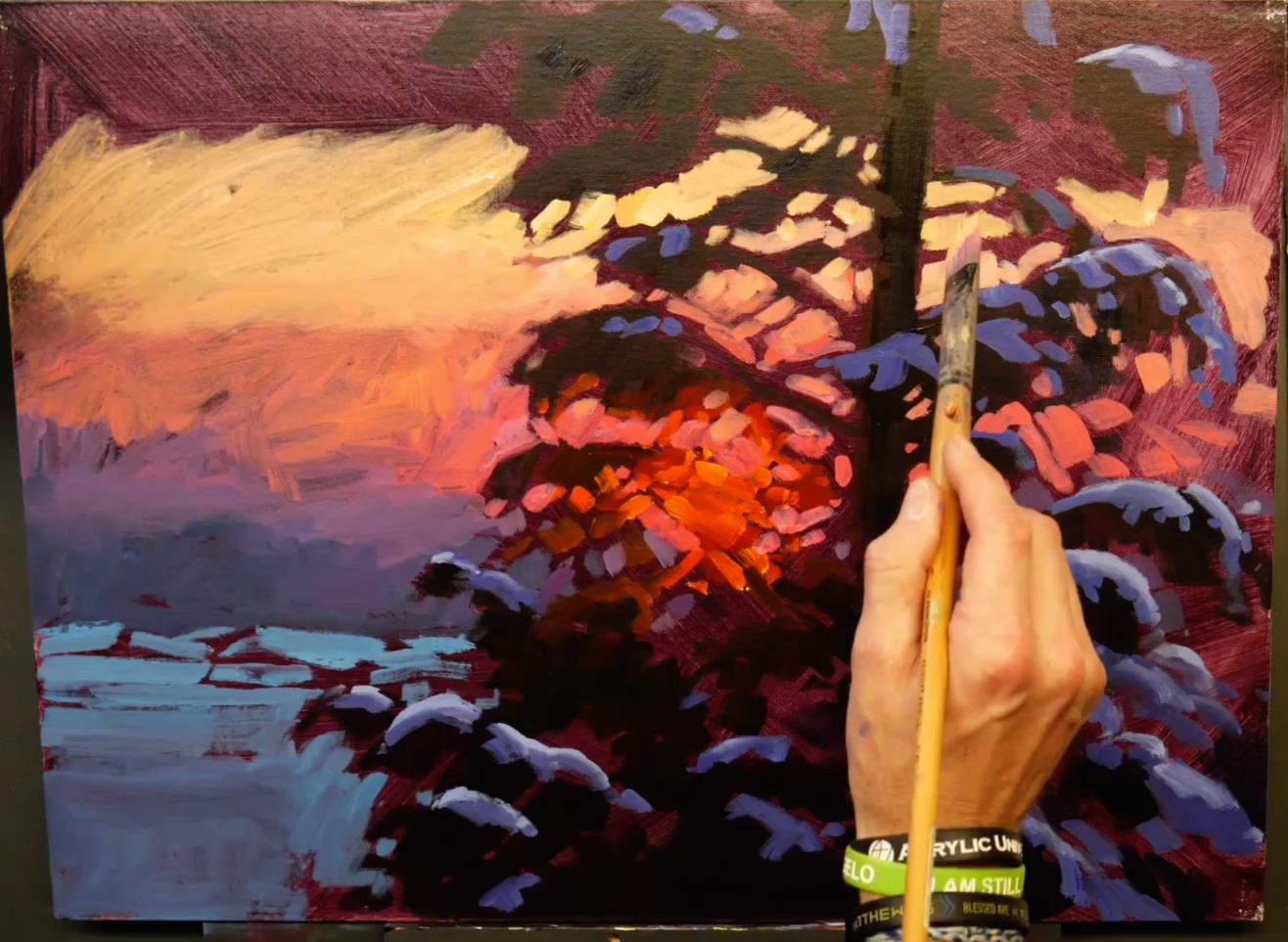
As I continue putting in the dark of the tree, I also establish the location of where the sun will be shining thru. I do this by applying the fist coat of vibrant colors to what will end up being the illuminated branches in that area. I use a mix of Naphthol Red and Cadmium Yellow Light as my first coat here.
One reason I put in these colors now is that to achieve brilliant highlights over a dark-toned background, I will need at least two coats of my highlight colors. So these colors begin to build up that highlight area.
Step 2: Snow & Background...
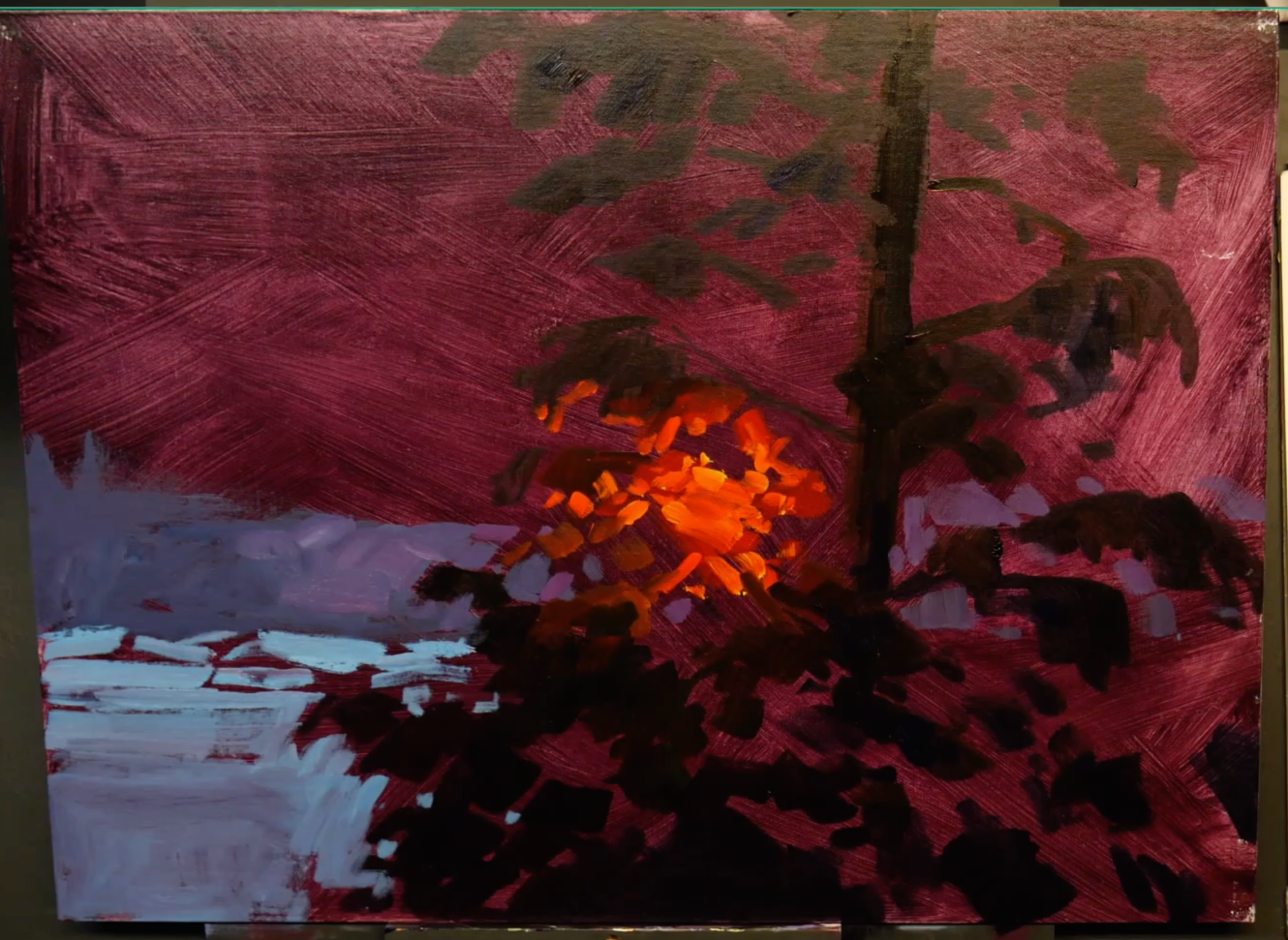
The next part I begin painting is the background trees and the snow. This is where it is important to make sure you are using your eyes and observing rather than just letting your mind dictate the colors and values you use based on its pre-determined knowledge. If you aren't careful, your brain will say, "Snow is white, paint it white", but observation shows us that the snow is actually still a mid-tone value.
I use a mix of Ultramarine Blue and Quinacridone Red with a bit of Titanium White for the trees in the background, and I use Phthalo Blue and Titanium White for the snow in front of that. There is still a little bit of the tree color on my brush however, and that comes thru and adds a bit of violet into the foreground snow.
...Including Snow On The Tree (Step 2 Continued)

I continue working on the snow, and I move into the snow on the branches. For this, I want to help show the form of the snow. There is a shadow side, and then it is lighter and reflecting the sky on top of the snow.
To paint the snow and show its form, I actually used two brushes. I mixed up the darker snow color and had it on one brush, and I mixed the lighter, top snow color and had it on the other brush. Alternating between the two brushes, I moved around the tree and put snow on the branches.
The darker snow color was mixed with Ultramarine Blue, a small amount of Quinacridone Red, and Titanium White. The lighter snow color was mixed by just adding some white to the darker mix.
Step 3: Shape Tree w/ Sky Colors
This is where the magic starts to happen. It is also where you might find this approach the most challenging. It is called "negative painting". It's tricky, because it's backward from how many of us learned to paint. When I first began in art, I was taught to paint the background first, then the foreground. You were probably taught the same.
In this, we are doing the exact opposite. We are shaping the foreground tree with the background sky colors. (Note: if you decide you want to try this approach, let me encourage you: expect this part to be challenging, but keep working on it. It can produce unique and gorgeous results. And you CAN do it.)
The sky is a gradation, and this is the first coat. I am mostly working to get the general color down and to shape the tree and branches so that the next coat of the sky can go faster and be blended better. The colors I use in the sky are a mix of Naphthol Red, Cadmium Yellow Light, and Titanium White. I started with more Naphthol Red at the bottom of the sky, and I add more yellow and white as it moves upward.
Step 4: Sunburst Highlights
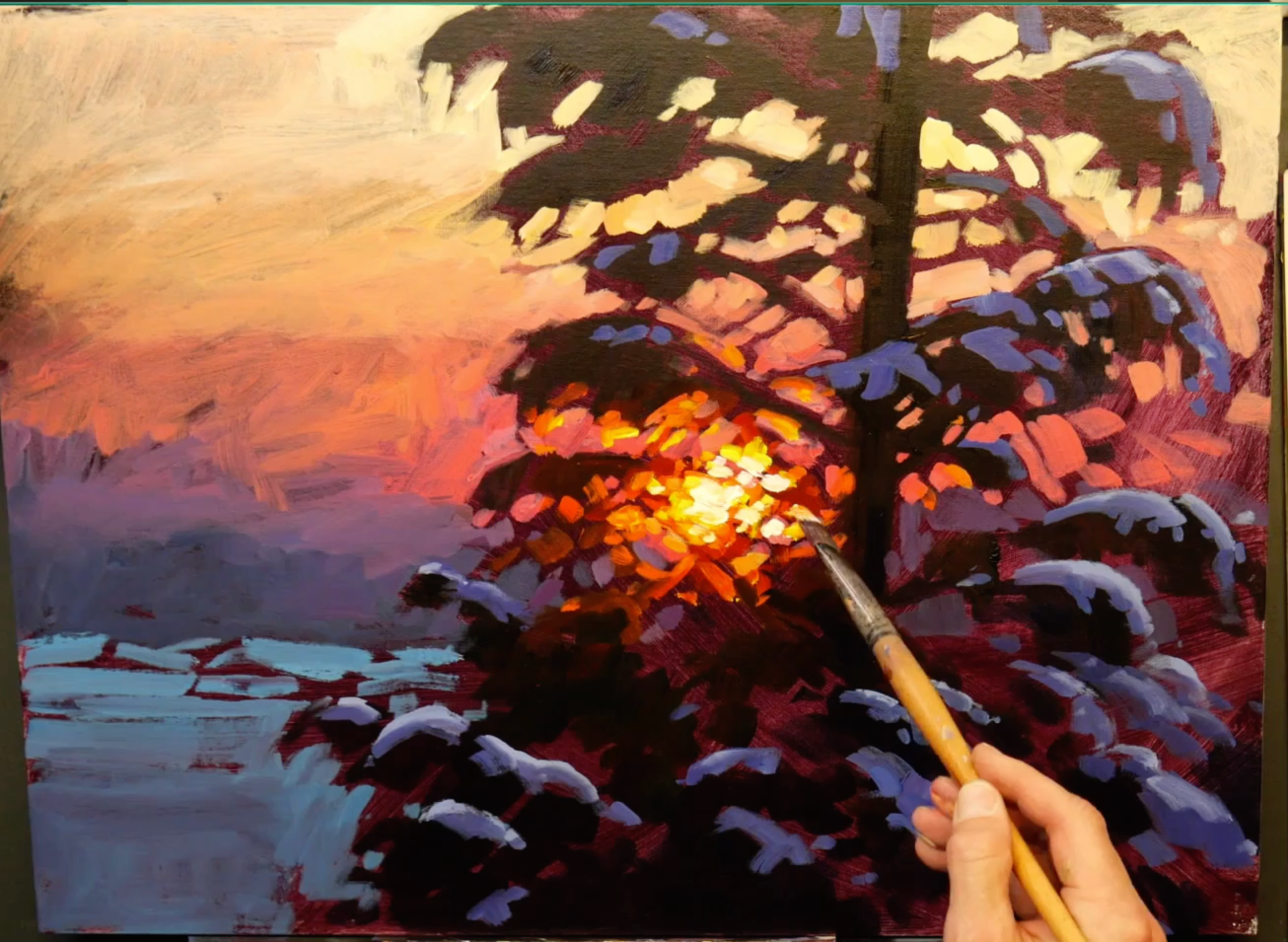
As mentioned before, it usually takes at least two coats of the highlight colors to bring the effect of brilliant light when painting over a dark-toned canvas. So although I've already put in the warm sunburst colors, this is the first pass with the true highlight colors.
I use Titanium White and Cadmium Yellow Light for this area where the sun itself is shining thru the branches. I try to leave the orange and red areas where branches could be. This is realistic as it shows how the intense light of the sun actually changes the color of the object it is shining around. The Cadmium Yellow Light also helps keep the light warm and glowing. In some places I put it down quite pure to show the sunlight reflecting off of the branches just outside the orb of the sun.
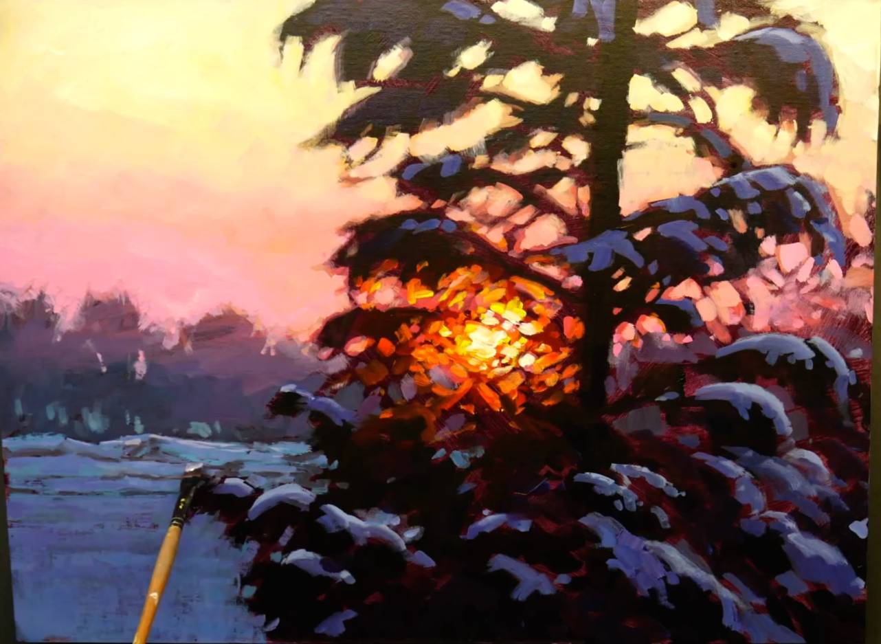
Step 5: Lighten Sky and Refine Shapes
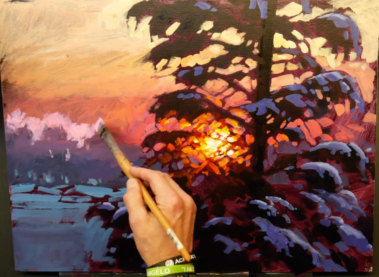
The second coat on the sky is also an opportunity to refine the shapes of the foreground and mid-ground trees. I start this gradation similar to before, although this time I use Quinacridone Red (PV-19) and Titanium White at the lowest part of the sky before I move to Naphthol Red and the colors I mentioned previously in Step 3.
Because trees are organic and have small branches where they meet the sky, I work to create a soft edge where they meet the sky in my painting. I do this by using a dry brush technique (dragging my brush lightly across canvas) and by smudging with my finger to reduce the hard edge that can happen so easily when using acrylic paints.
As you can see, after finishing the sky with this second coat, there is still some dark showing through. You can notice it above the trees on the left side. This tells me that I will want to do a third coat in the sky so that it can be as light and luminous as I want it to be. While this adds time, doing a third coat on the sky also allows an opportunity to keep creating soft edges and produce a more subtle gradation between the colors.
Step 6: Final Coat Sky...
For this final gradation in the sky, I mixed up a larger amount of my colors so that I could grab them and intermix quickly as I moved up the sky. I started at the bottom again with the Quinacridone Red (PV-19) and Titanium White mix, and moved thru Naphthol Red and into Cadmium Yellow Light with white at the top of the sky.
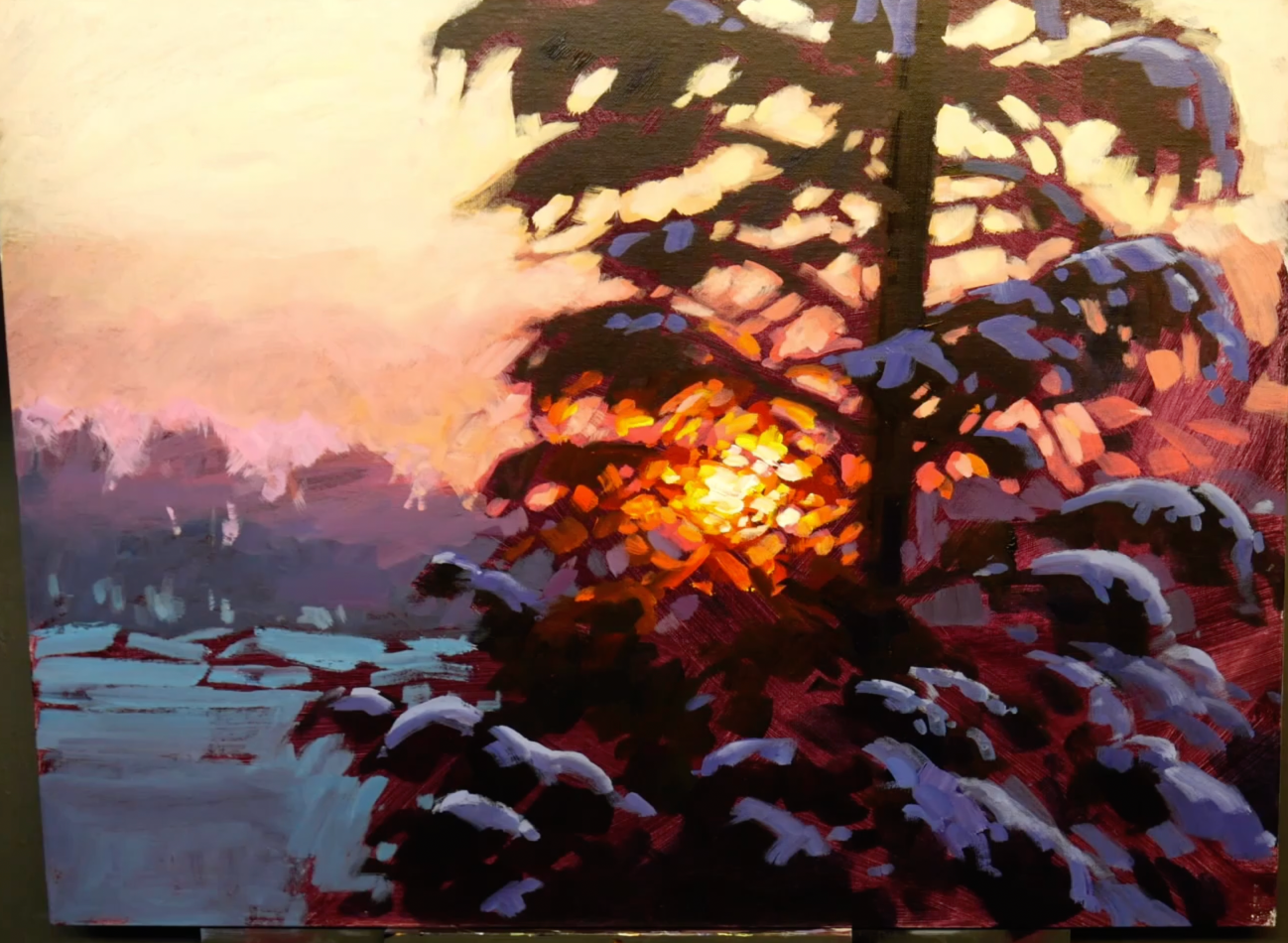
Because it is the third coat and the shapes are established already, I can move more quickly and the gradations are smoother. But I wasn't trying to make them completely smooth, because I like to see brushstrokes in my work. And you can see that in the final image of the painting.
But I do make a change to the shape of the tree as I do this final sky. I realized that I wanted to have a bit more of an opening and I removed a couple branches on the upper right side of the tree.
...and Final Details (Step 6 Continued)
While I'm sure an argument could be made for the importance of every stage, finishing a painting well might be the most important. That probably seems obvious, however it's also not always easy to know how to finish a painting. For instance, there are questions:
How much more should I do? How detailed should I get? Is it good enough right now? How do I know when to quit?
For me, I would rather stop a little early than too late. So, I try to analyze my painting and figure out what tangible improvements could make the overall painting better. When I identify something I work on it specifically, but I try not to just keep painting without having specific improvements in mind.
At the end of this painting, I noticed that the sunburst highlights could be intensified, so I did that.
Then, I saw that the darks that were in the mid-ground were almost as dark as the foreground darks. This was making it difficult to see the mid-ground as being further back. It limited the perspective of the painting. So, I began trying to subdue them a bit by lightening them. This was the final detail I worked on. After that, I decided the painting was done, so I signed it.
The Final Painting
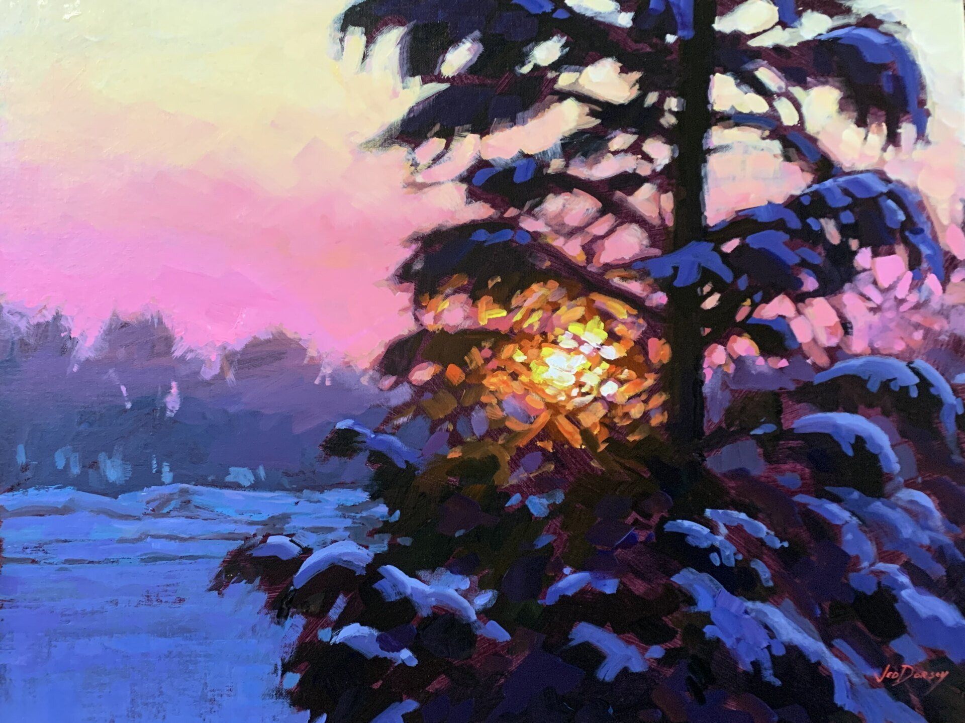
This painting was completed as a demonstration for Acrylic University.
Thanks to Ilyas Aliev for the reference photo.
Start Painting For FREE: