A Complete Guide on How to Paint Water with Acrylic Paints
Introduction to How to Paint Water
Leonardo da Vinci once famously remarked,
"Water is the driving force of all nature."
Majestic, beautiful, and robust, water is indeed essential to life.
But when it comes to painting it, what color do we ascribe to water?
Is it a shade of blue, or perhaps multiple shades of blue?
Is it verdant green, subdued, or vibrantly colored?
Could it be tranquil or wildly turbulent?
Let's explore these questions together as we embark on our artistic journey of painting water. In this in-depth blog post on how to paint water we will dive into various styles, from the frothy crash of ocean waves to the soothing serenity of a calm lake.
Outline:
- Three Foundational Principles of Painting Water: First, we will identify three foundational principles to help you paint water effectively. These are general guidelines, and there will certainly be exceptions. However, they'll serve as a great starting point for you as you venture into portraying water in your art.
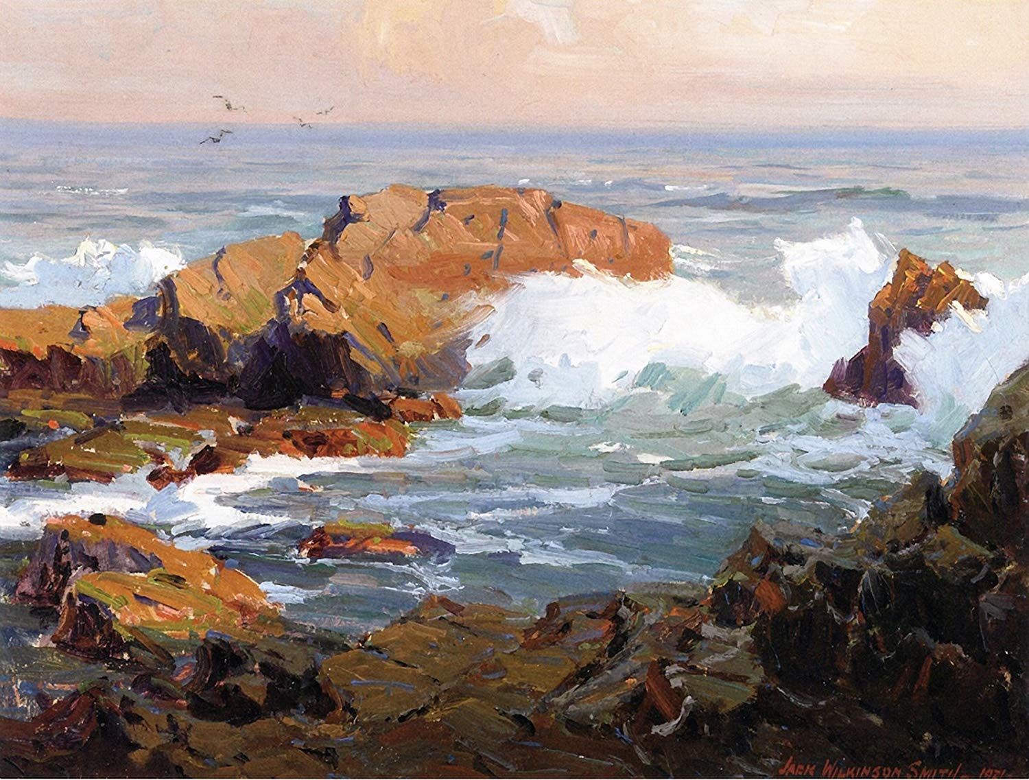
- Copying a Master's Painting: Next, we will delve into replicating a master copy of an artwork from Jack Wilkinson Smith, an artist celebrated for his breathtaking paintings of the California coast. This exercise is going to be an engaging exploration of technique and style.
- Practical Water Painting Techniques: Following that, we will delve into two specific painting techniques beneficial to effectively capturing the essence of water. Water has a unique characteristic in that it can both reflect AND absorb light. The techniques that we will cover in this blog post will help you accurately portray these characteristics.
- Practice Painting: Finally, we'll put these techniques into practice, as we paint a picturesque lake scene incorporating various water effects. This is where the theories we learned will start to come to life on canvas.
Thank you for joining us on this artistic journey. Now, let's jump right in and uncover the three fundamental keys to painting water!
3 Fundamentals for Painting Water
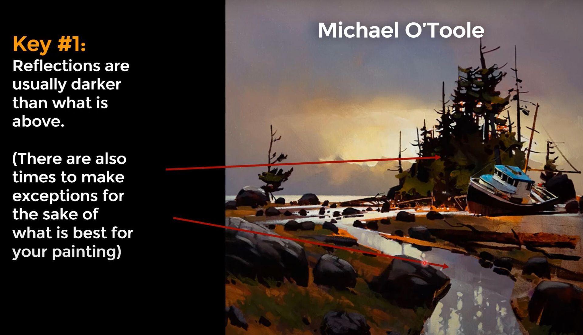
Fundamental #1 - Reflections
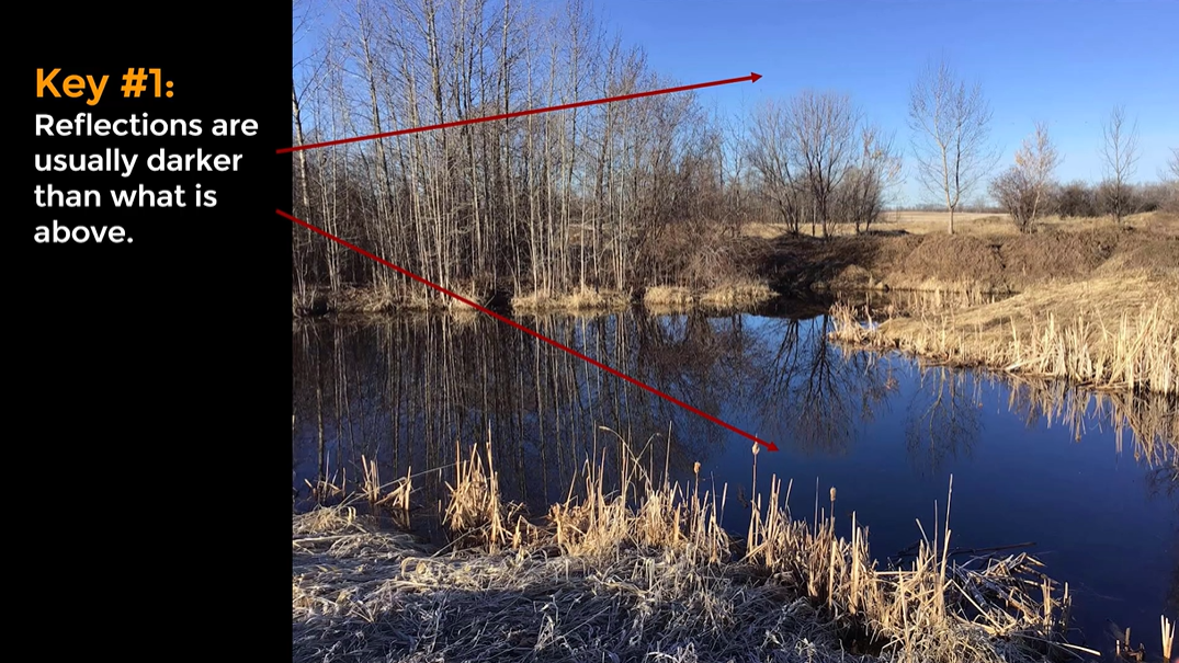
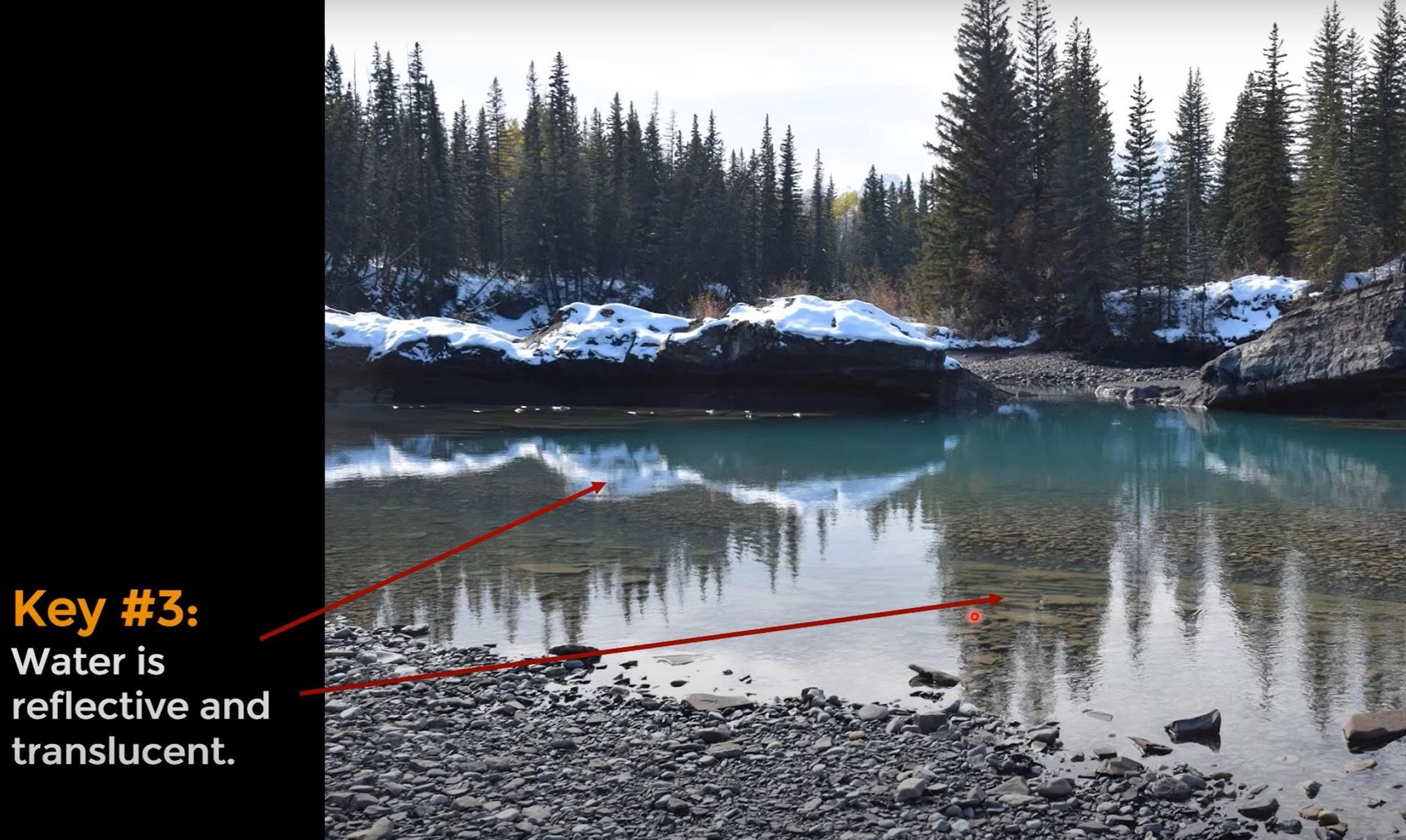
As a general rule, reflections are often darker than the object or scene they mirror. A great example can be seen in a photograph taken from Alberta, Canada, where the reflected sky in a small pond appears noticeably darker than the actual sky.
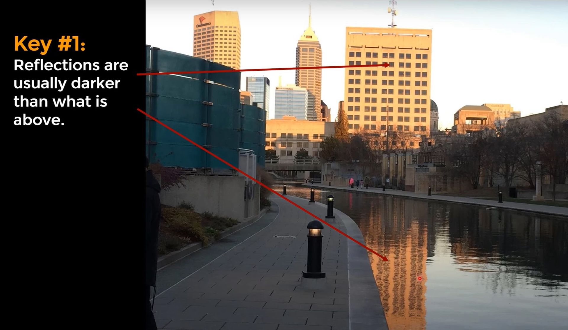
The same principle is visible in a cityscape from Indianapolis, where the reflected building on the canal appears deeper and richer in color compared to the actual structure.
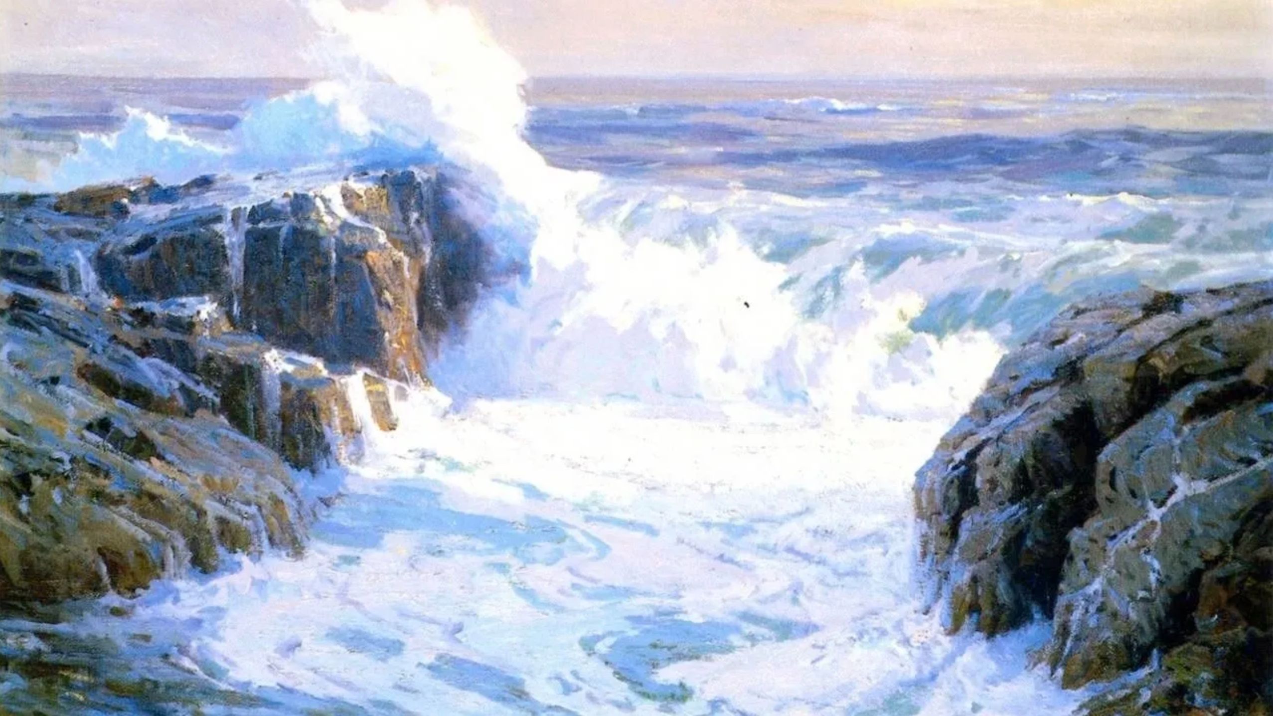
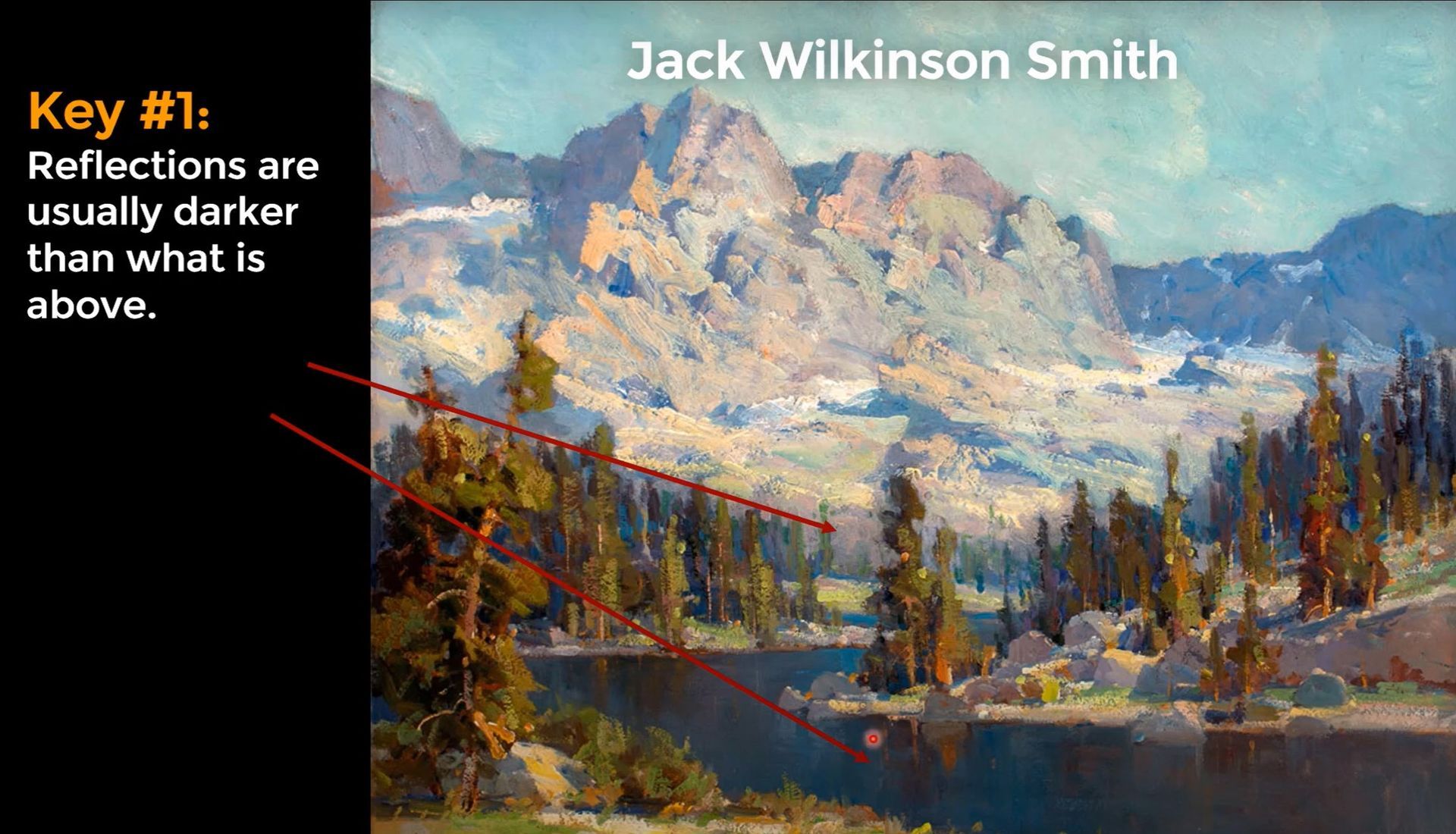
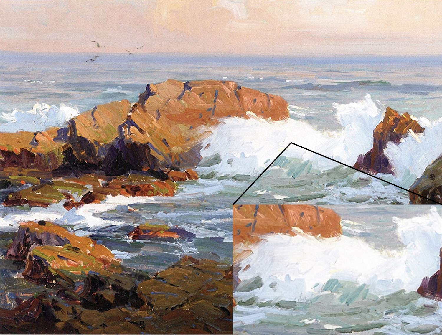
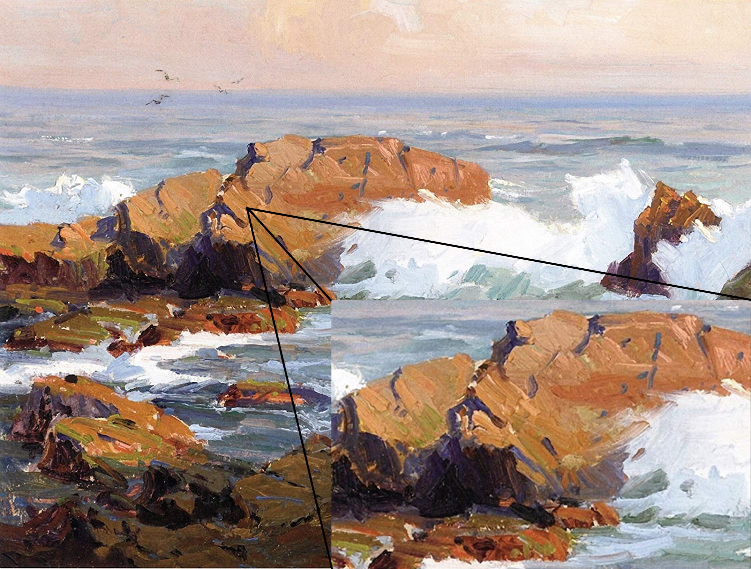
Renowned artist Jack Wilkinson Smith’s work serves as a fantastic example of this principle in the world of painting. His reflections are noticeably darker than the subjects they mirror. However, keep in mind that art isn't strictly about following rules. There are times when you might want to make exceptions in the interest of your painting.
Another piece by artist Michael O'Toole presents an example where a water reflection appears lighter than the actual scene, creating a more inviting path for the viewer’s eye, and thus, enhancing the painting.
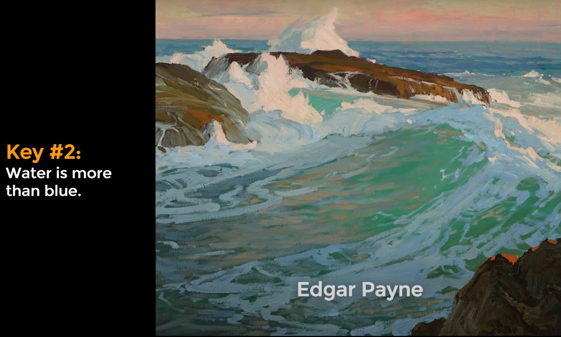
Fundamental #2 - Color
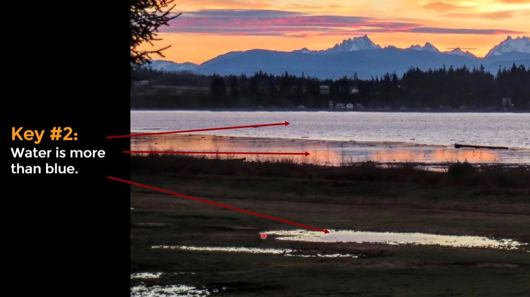
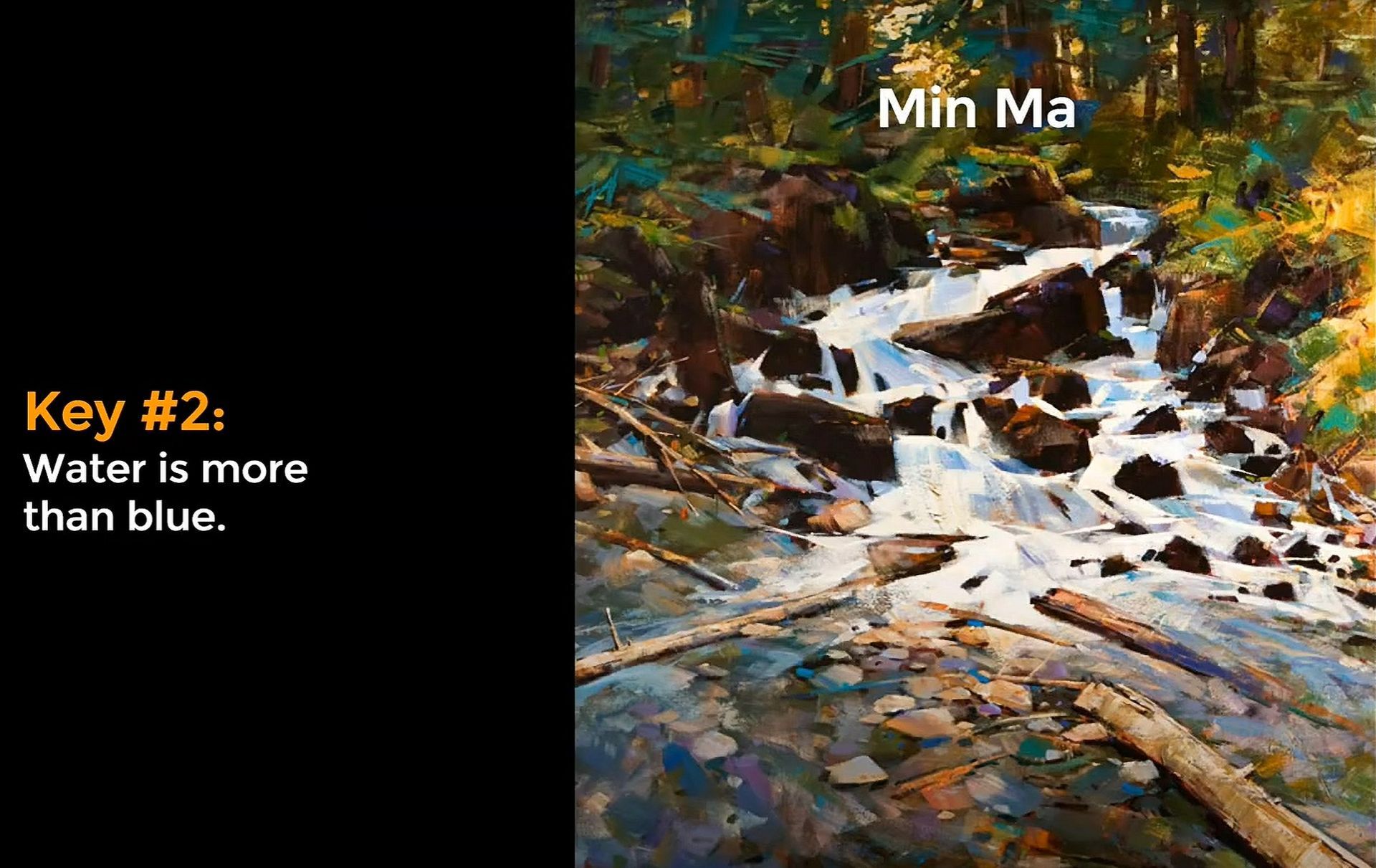
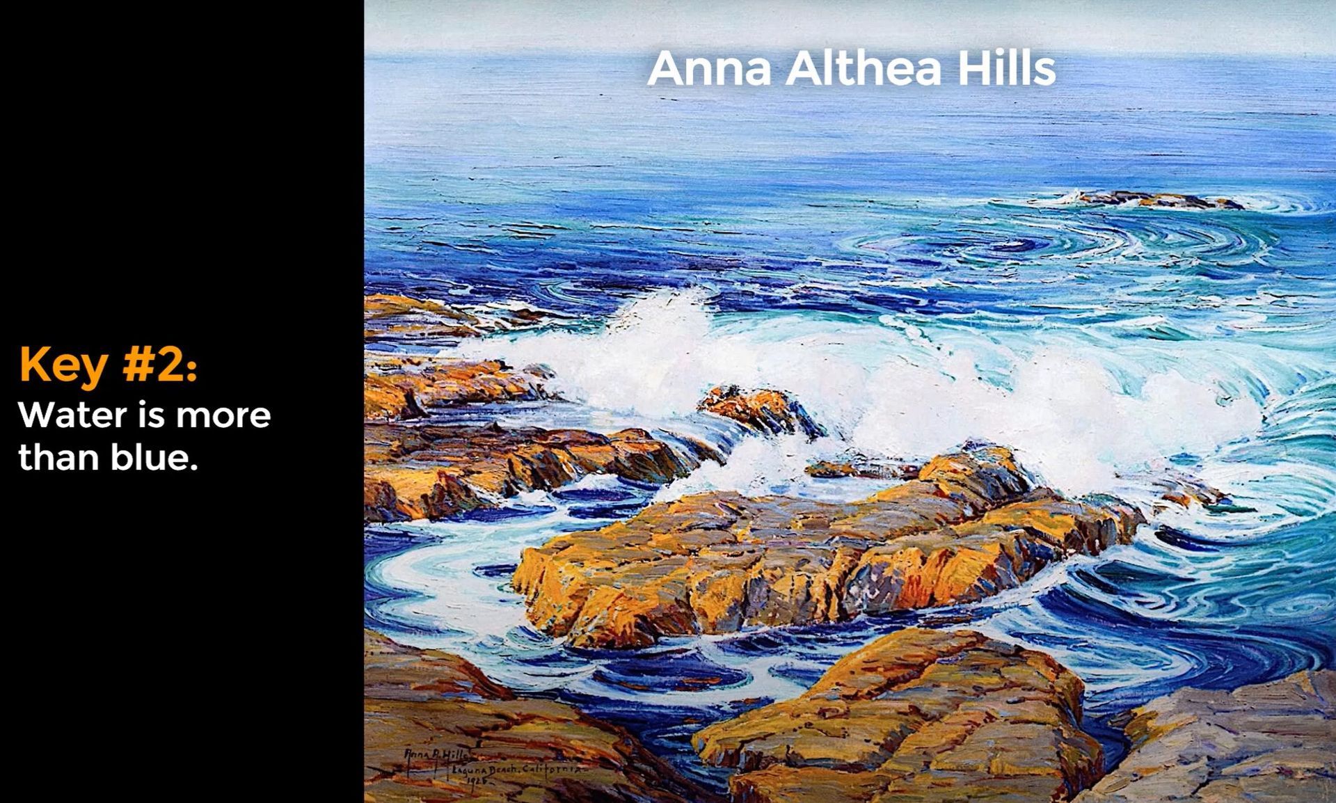
Commonly, we associate water with the color blue. And that's not without reason; water absorbs light, particularly reds and yellows, and reflects back the blues. However, water is more than just blue. When we observe a photograph, we can see water colors ranging from silver, to orange and even light yellowish-green.
Take for instance Min Ma’s painting, teeming with a variety of colors in the water, or Anna Althea Hills’s artwork, where subtle varieties of blue, green, and even hints of violet add depth to the water.
Other artists such as Edgar Payne have even introduced warm peachy hues into their depictions of water. The lesson here is not to limit yourself to blues when painting water. While blue is a common color for water, exploring other colors can add interest and depth to your artwork.
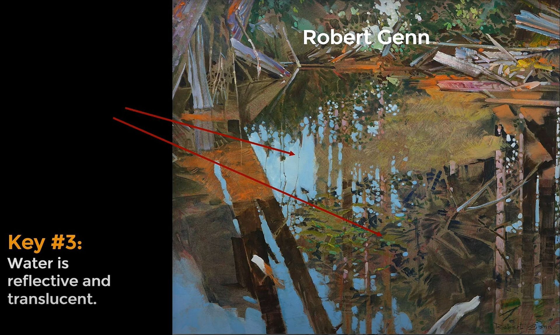
Fundamental #3 - Reflection & Translucency
This quality of water can be quite fascinating. It allows us to see both the reflections on the water’s surface and, in some cases, what lies beneath it.
Robert Genn's painting wonderfully illustrates this balance between reflection and transparency.
To summarize on these three key points: reflections are generally darker than the reflected objects, water is more than just blue, and it can be reflective and translucent at the same time. There are many complexities to consider when painting water!
The challenge to mastering this lies in careful observation and adapting to what is best for your artwork. There are no hard and fast rules; you need to understand why certain things work and then adapt these to your unique style and the requirements of your painting.
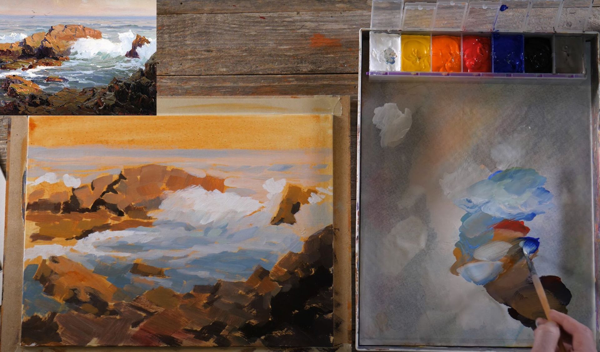
We’re now going to take these fundamentals and apply them to our first practice painting. For this practice session, we’re going to copy a painting from the master artist Jack Wilkinson Smith.
Water Practice Painting #1 - Master Copy
Supplies
As artists, we're always growing, and an essential part of that is learning to work with fewer colors. My go-to palette consists of Titanium White, Cadmium Yellow Light, Cadmium Orange, Cadmium Red Medium, Ultramarine Blue, Mars Black, and a gray. This simple palette satisfies most of my painting needs and allows for an easier workflow. We will use this same set of colors throughout this blog post.
Planning
Before I start painting, I like to think about the composition of the painting.
Smith's composition is dynamic with its crashing waves. To replicate this, I prefer using a paint marker for the initial sketch. The color of the marker doesn't significantly impact the painting process, but I advise using an acrylic-based marker, as it can be layered over with paint easily.
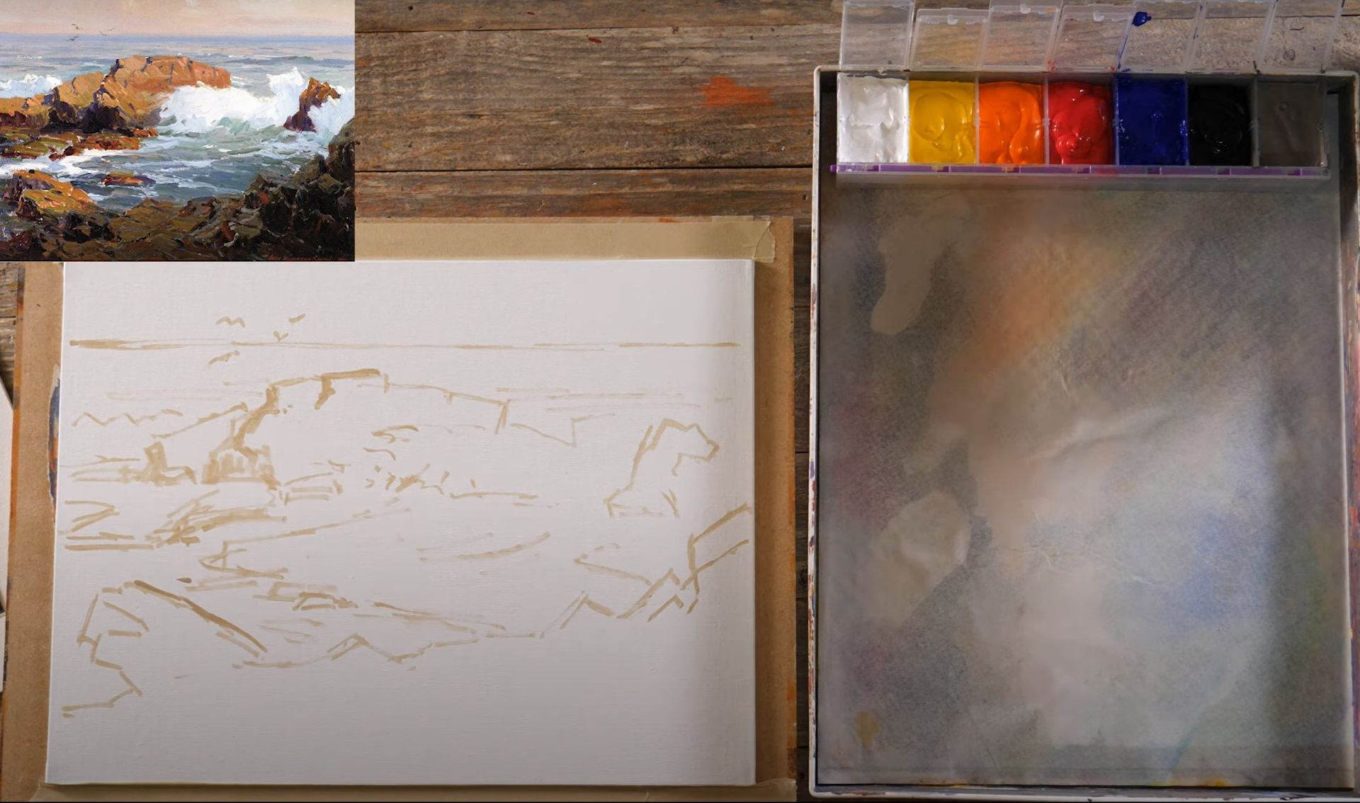
Another thing I notice about the composition is that your eye is drawn to this area with the rocks and the big wave. We want to make sure the viewer’s eye is drawn to the same place in our painting. To do this, we need to make sure that the water and the rocks next to it have enough contrast.
Sketching
While sketching, I identified certain areas that needed more depth and decided to revisit them. Not all details can be captured with a marker, so I grabbed a brush and started painting over to add more dimension, focusing on darker areas. For the darkest parts, I used a mix of warm black (black with a tinge of red) and a lighter gray for the not-so-dark areas. This technique is used to identify the elements even after the paint dries and a tone is applied over it.
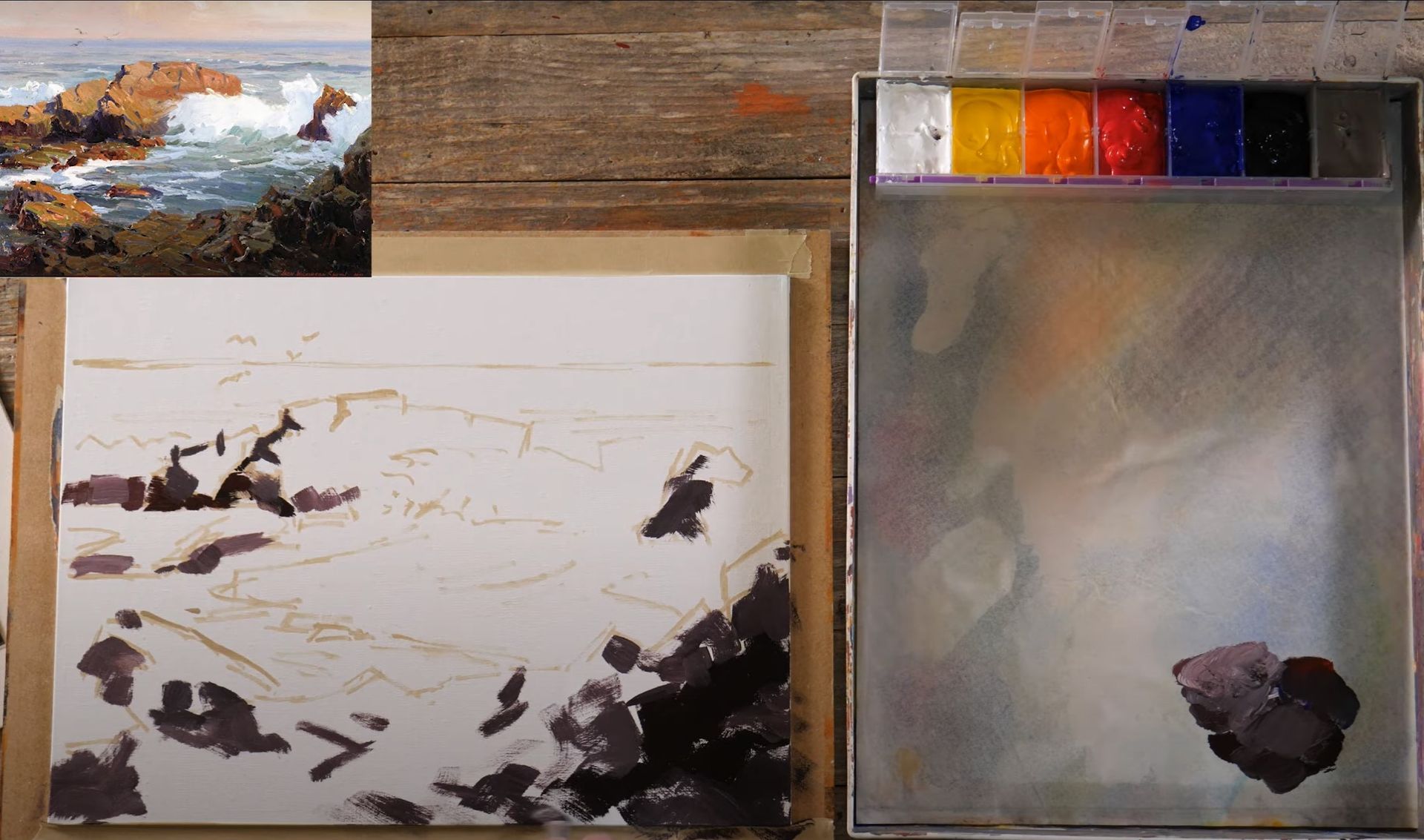
I then took a short break to dry the painting with a hairdryer before proceeding with the next step, toning the canvas. Quinacridone gold, a warm, transparent color, is my go-to for this task. After applying it on the canvas, I could faintly see the initial sketch, and the areas painted over with darker paint remained clearly visible.
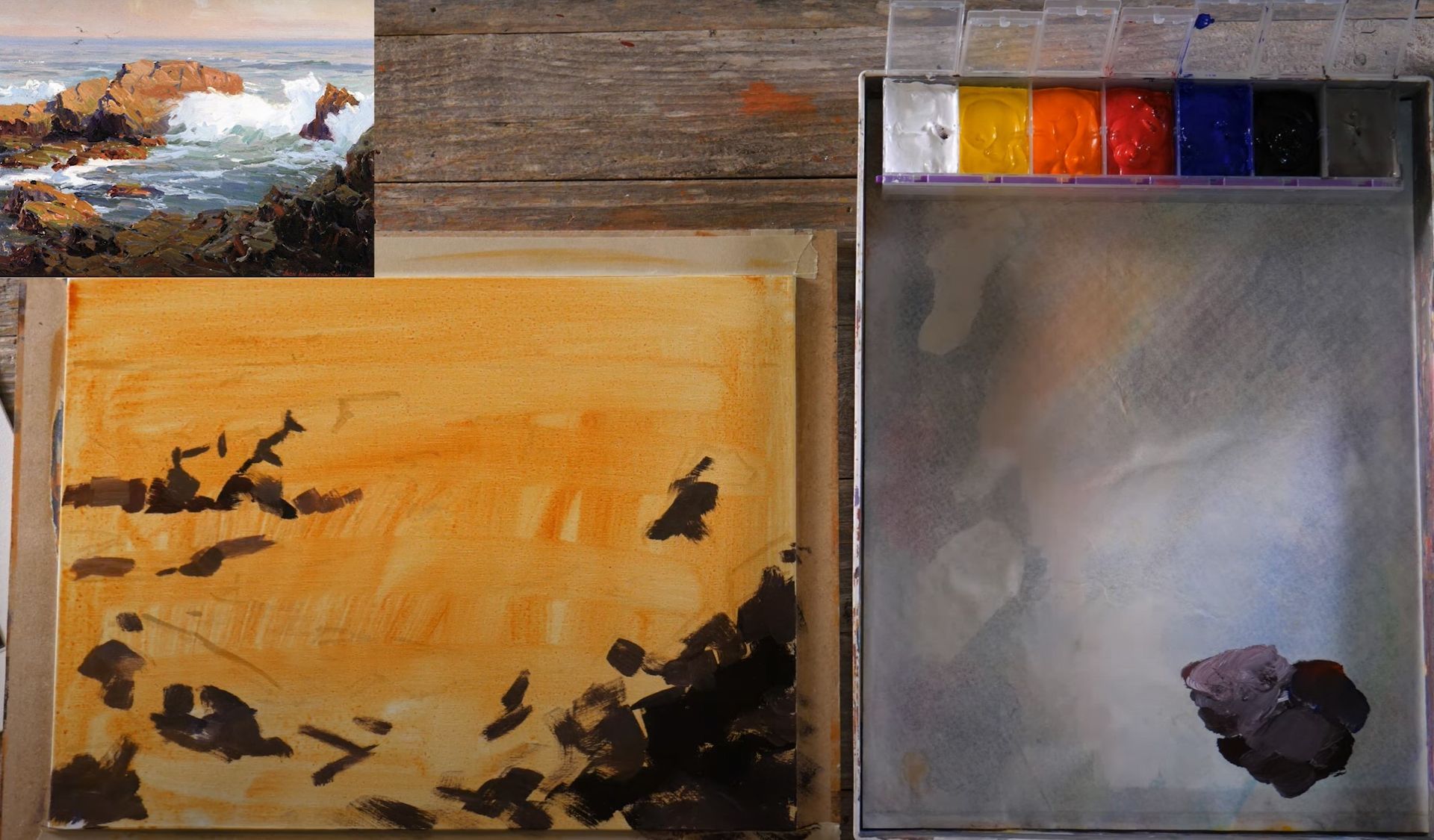
I then began painting directly on the toned canvas without waiting for it to dry completely, providing me with opportunities to work with softer edges and a wet-on-wet technique. This stage involved matching the colors and values in the reference painting with my own, adjusting the shades by adding more yellow or red as needed, or making them darker or lighter.
During this 'blocking' stage, I was primarily trying to capture the essence of the colors from the reference onto my canvas. I was also comfortable with some parts of the underpainting peeking through, as its warm color added depth.
There are two things I’m trying to keep in mind as I paint this:
- Although my printed reference had more subdued colors than the original artwork, I tried to remember the vibrancy of the original colors and incorporate them into my painting.
- While painting a scene with water, it's essential to remember that water reflects everything around it. Therefore, the colors from the rocks and the sky in the painting subtly influence the color of the water.
QUICK TIP: If you’re stressing about matching your colors accurately, one thing you can do is make sure you cover your entire canvas during the block-in. Covering the entire canvas first will give you a better understanding of whether your color and value choices are working as desired.
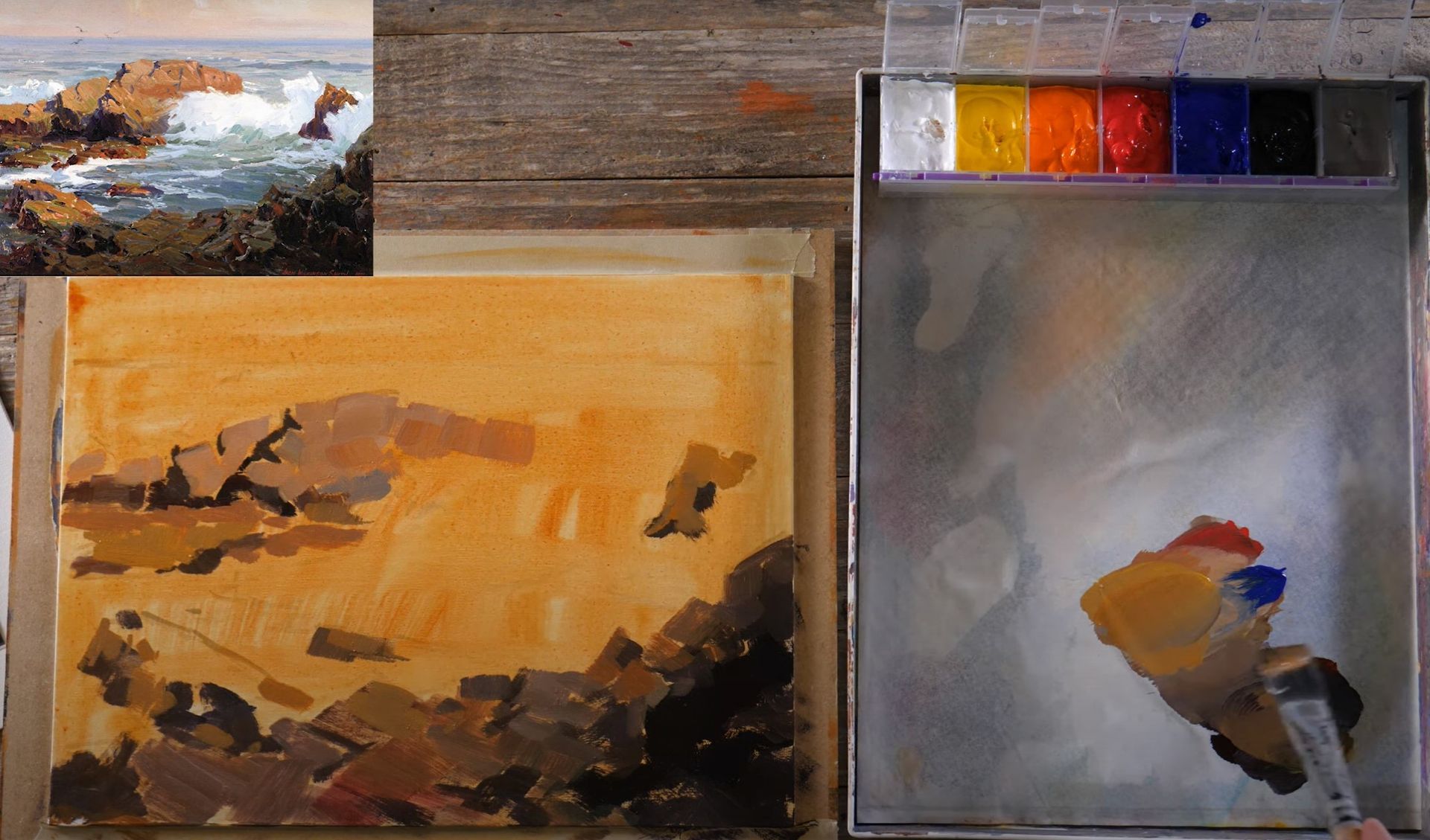
Refine
I’m now going to turn my attention to the water. We’ll begin by mixing the first colors we observe in the water. The initial color you may notice is blue, which we can create using ultramarine blue. As you compare the color of the blue paint with the color in the water in the reference photo, you might notice that the water has a slightly greenish tone. To match this color more closely, blend in a bit of yellow with your blue, creating a mix of a little blue, a touch of white, and some yellow.
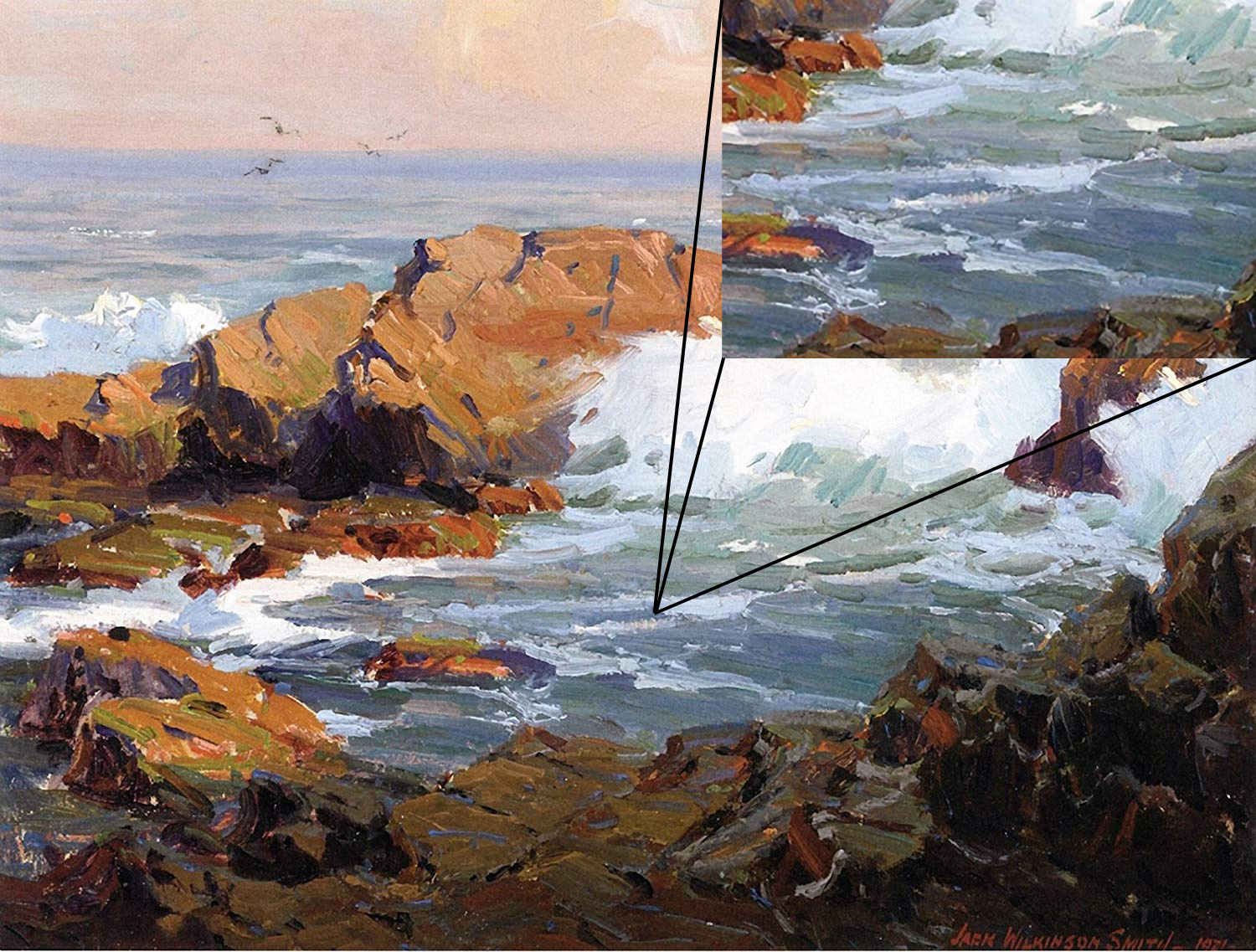
As we look further into the painting, it becomes clear that the water has darker and deeper tones towards the bottom of the canvas. This effect is due to the water reflecting the sky directly above, which is typically darker than the sky along the horizon. Thus, the closer the water is to us, the darker it appears, with deeper blues and blue-greens. To recreate this effect, gradually add more white to your blue mix as you move up the canvas.
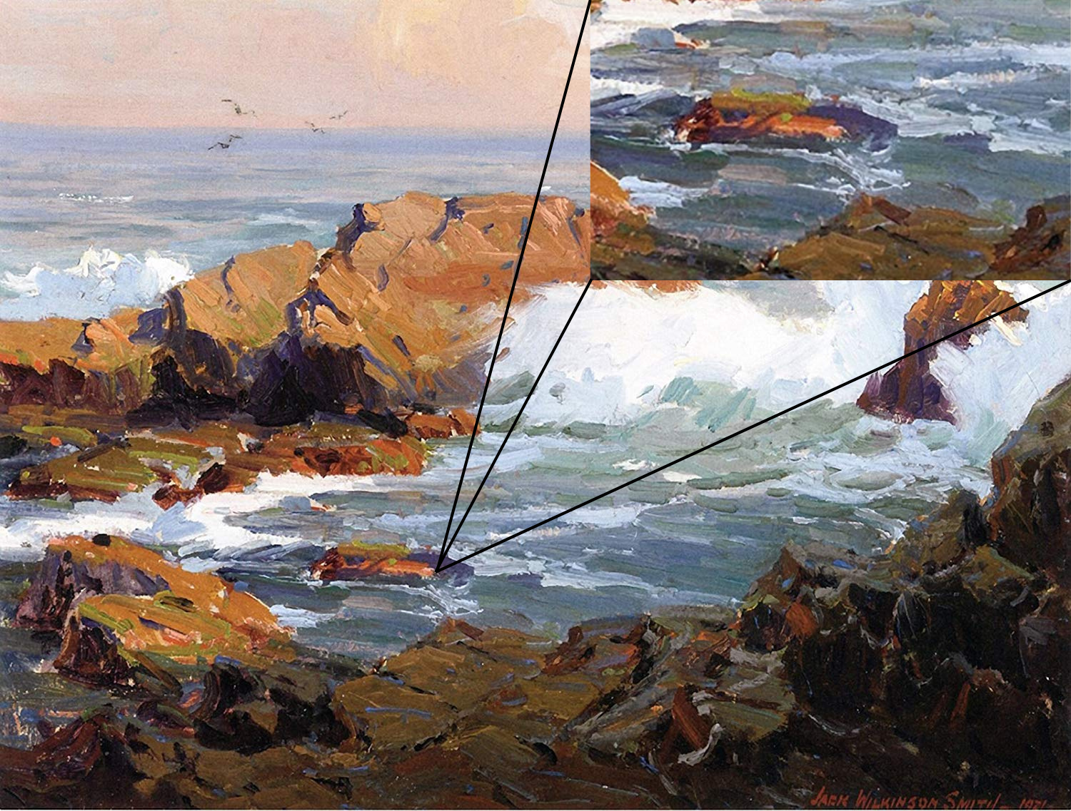
Again, remember that water reflects the colors around it. Pay close attention to the warmer colors reflected from the surrounding environment and subtly include these in your painting. A hint of cadmium orange mixed with your existing color can create the warmth seen in the wave.
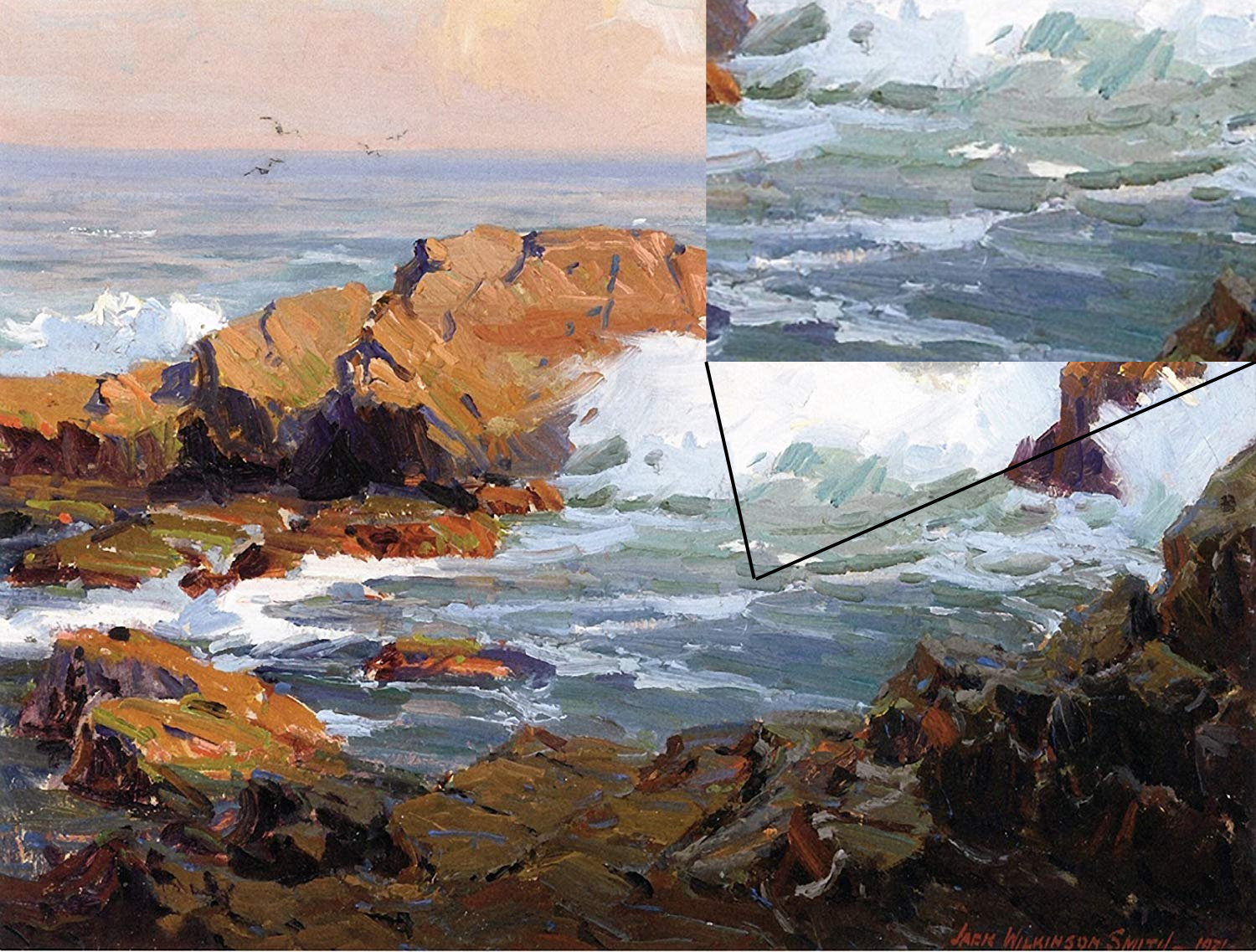
Like we’ve said before, water isn't just blue; it's alive with numerous colors and tones. Jack Wilkinson Smith does a great job of capturing this in this painting. Understanding these nuances comes from careful observation of real water and how it interacts with light, the environment, and different times of the day.
Now let's give the waves a frothy look. For this, we'll need pure white. A bright, sunlit, white wave set against darker elements creates a brilliant contrast that brings the wave to life.
Next let’s turn our attention to the rocks in the scene. Start by filling in the lighter areas, leaving some spaces for the cracks. You can always come back to add more details. You might notice that the shadows in the rock crevices lean towards a lighter violet or blue.
This blue shadow can create a sense of distance and depth. Little brushstrokes of this color can give the impression of water splashed onto the rocks, glistening in the shadows.
Keep observing your painting. Squint your eyes and evaluate the values. Are there areas that need filling in? Any colors that seem off? The secret to painting water, and painting in general, is careful observation and the willingness to adjust and adapt as needed. You're not just copying an image; you're making intentional changes to create a piece that feels alive and vibrant.
We might not perfectly recreate the beauty of the original, but even achieving 30-50% of that would be a major success.
The original painting by Smith was probably a bit bigger than our 12x16 canvas, so we have to remember that certain details and nuances he could capture might be harder for us to include.
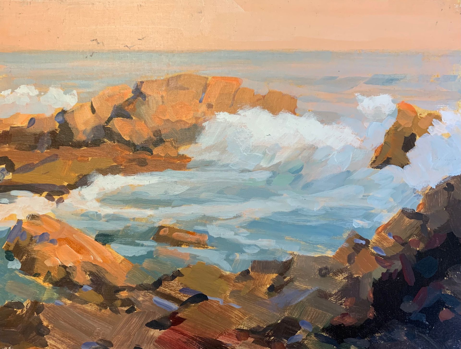
When all is said and done, I feel like I did a good job capturing the essence of this beautiful painting by Jack Wilkinson Smith. Next we’re going to cover different brushstroke techniques you can use for painting water.
Painting Reflections
This first technique we’re going to practice is aimed at helping us master the art of reflections.
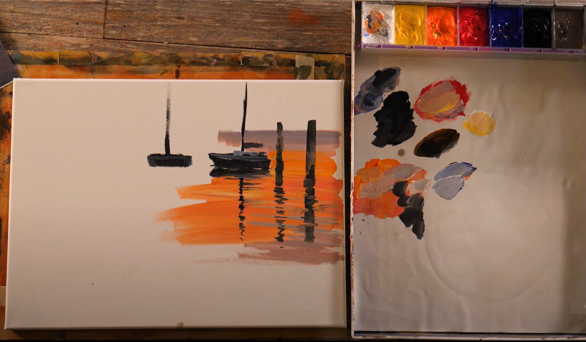
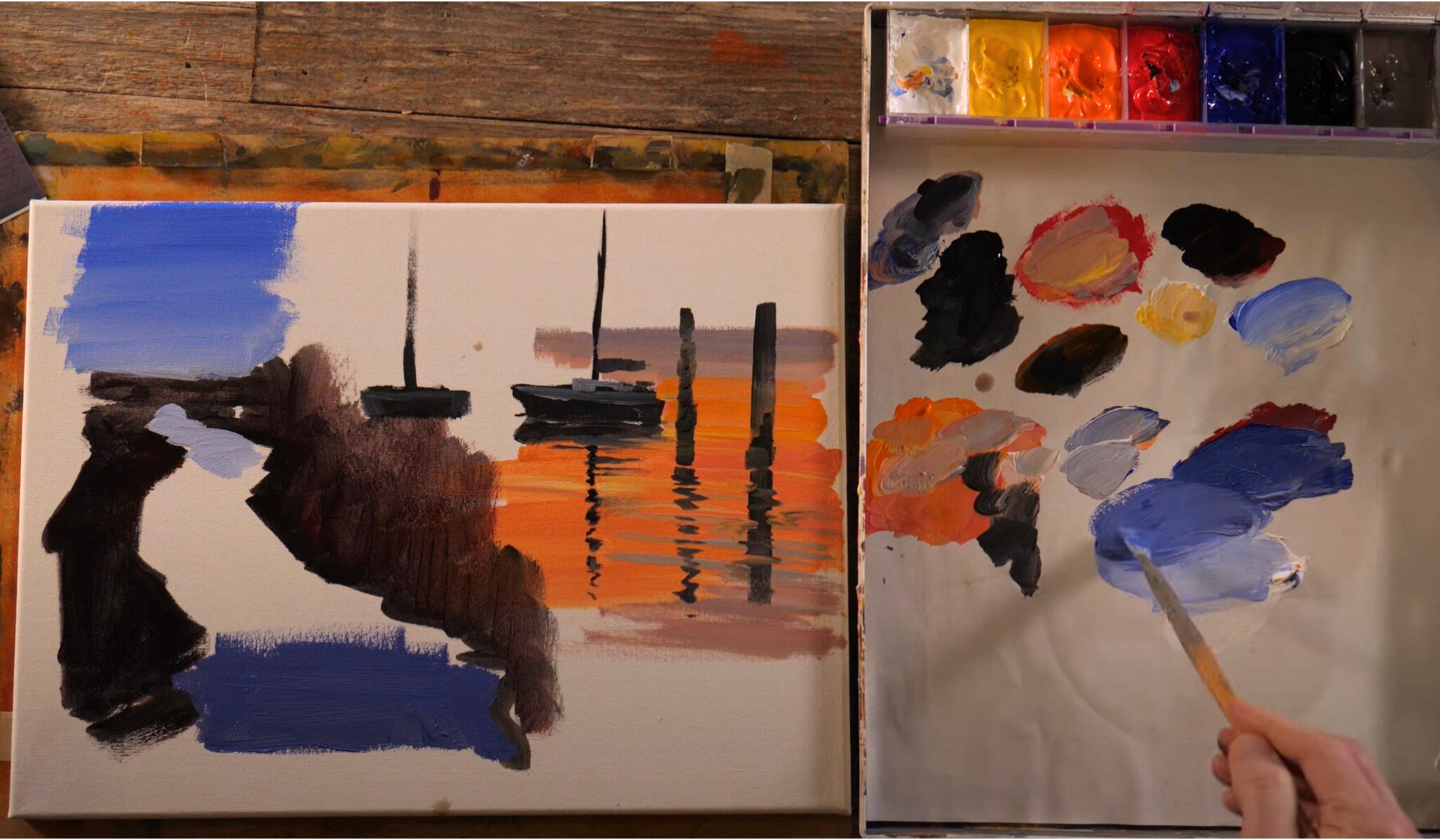
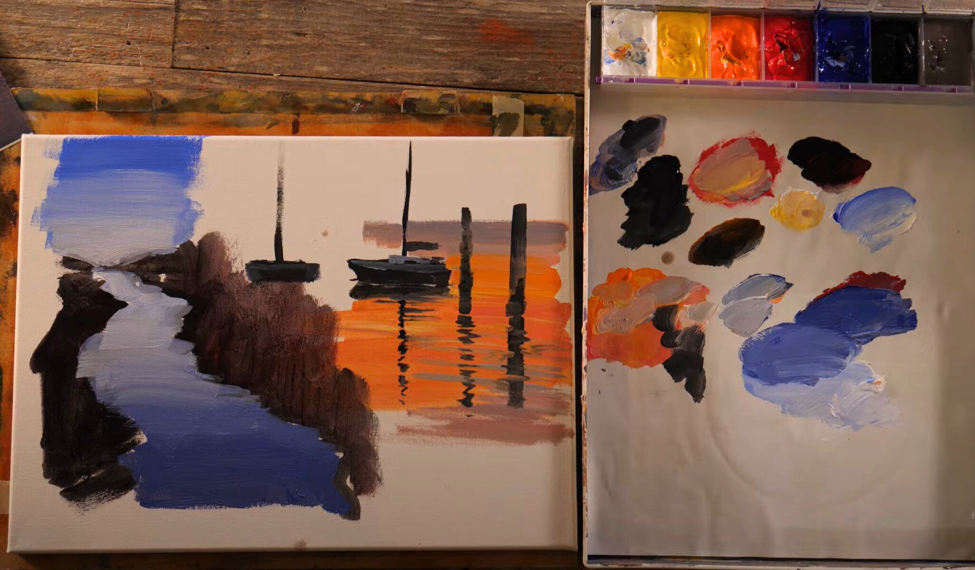
For this practice demo, we’re going to paint a scene with a few sailboats moored in a calm lake or a serene bay.
As a reference, I'm referring back to a morning scene I captured during a Plein Air competition. Here's how you can bring this to life on your canvas:
- Sketch your subjects: Begin with rough sketches of your sailboats on the canvas. Don't worry too much about the details; the focus here is on the technique of painting the water.
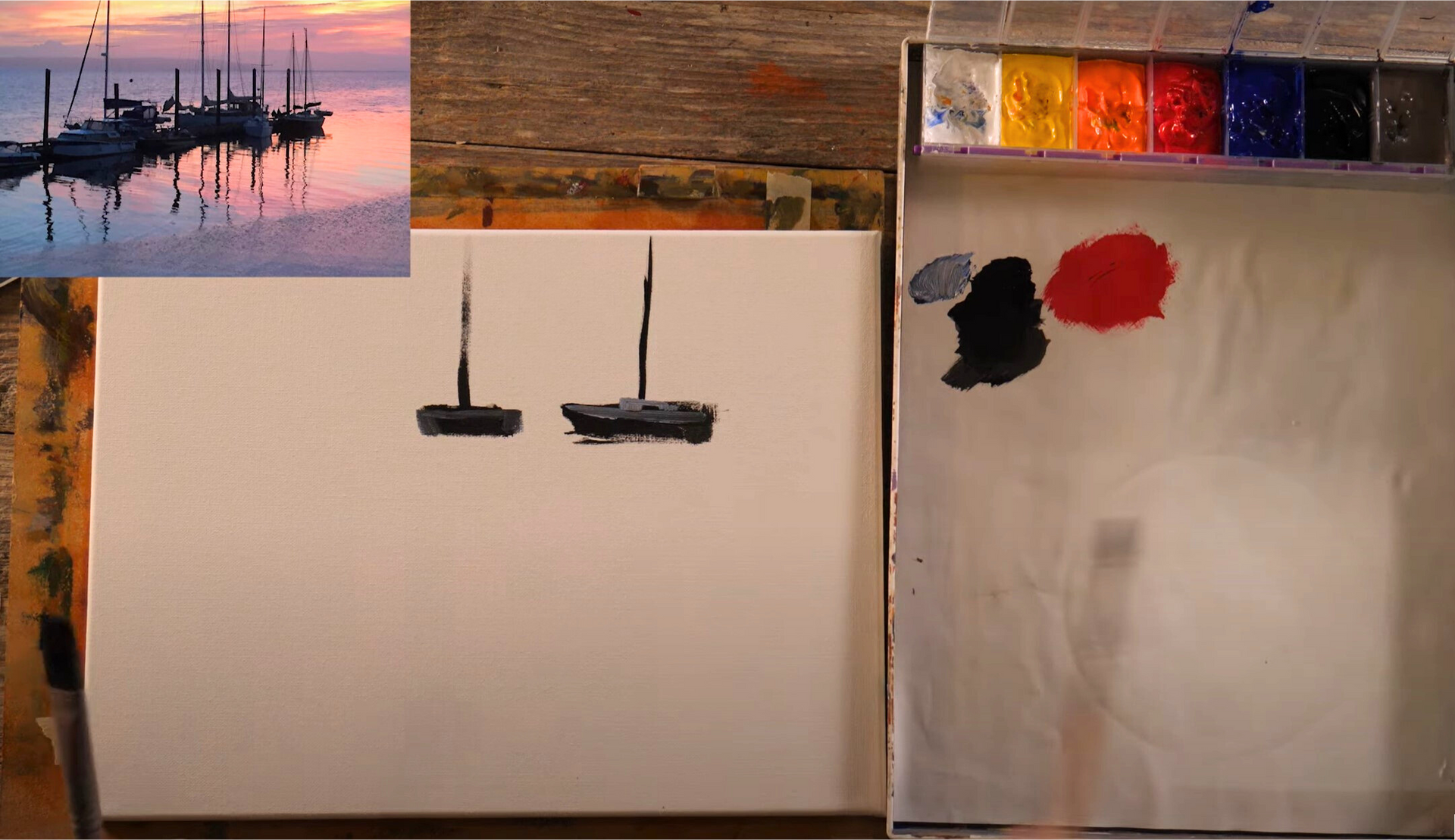
- Establish the waterline: Decide where the water meets the hull of the boats - this line essentially divides your subject from its reflection.
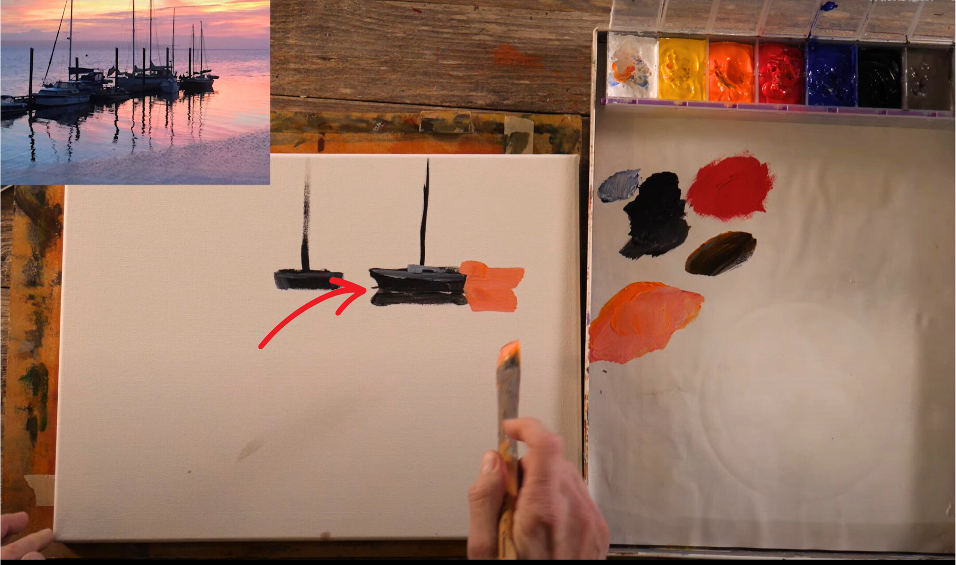
- Paint the base of the water: Choose a base color for your water, reflecting the ambiance of the scene. In our example, it's morning, so perhaps a soft blue or a cool violet would work well.
- Create Reflections: Now, let's add reflections. Paint them as slightly broken lines that mirror the form of the boats above. This broken line effect adds to the feeling of a reflection, mimicking the gentle ripples of water.
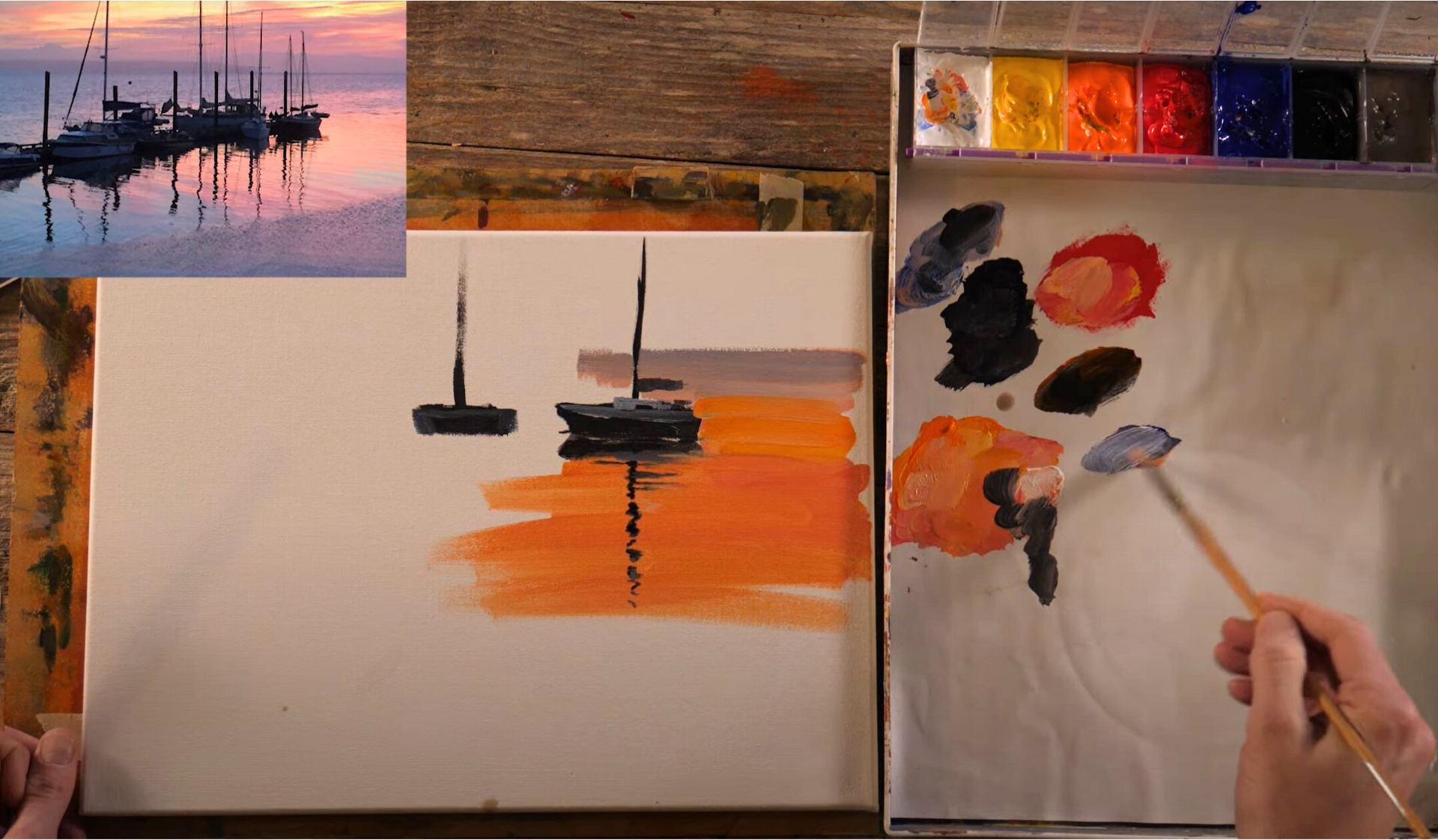
- Vary the colors: Introduce slight variations in color to your reflections. This change in color is caused by small waves in the water altering the reflection's appearance. Keep these variations subtle - even a few brushstrokes can make a difference.
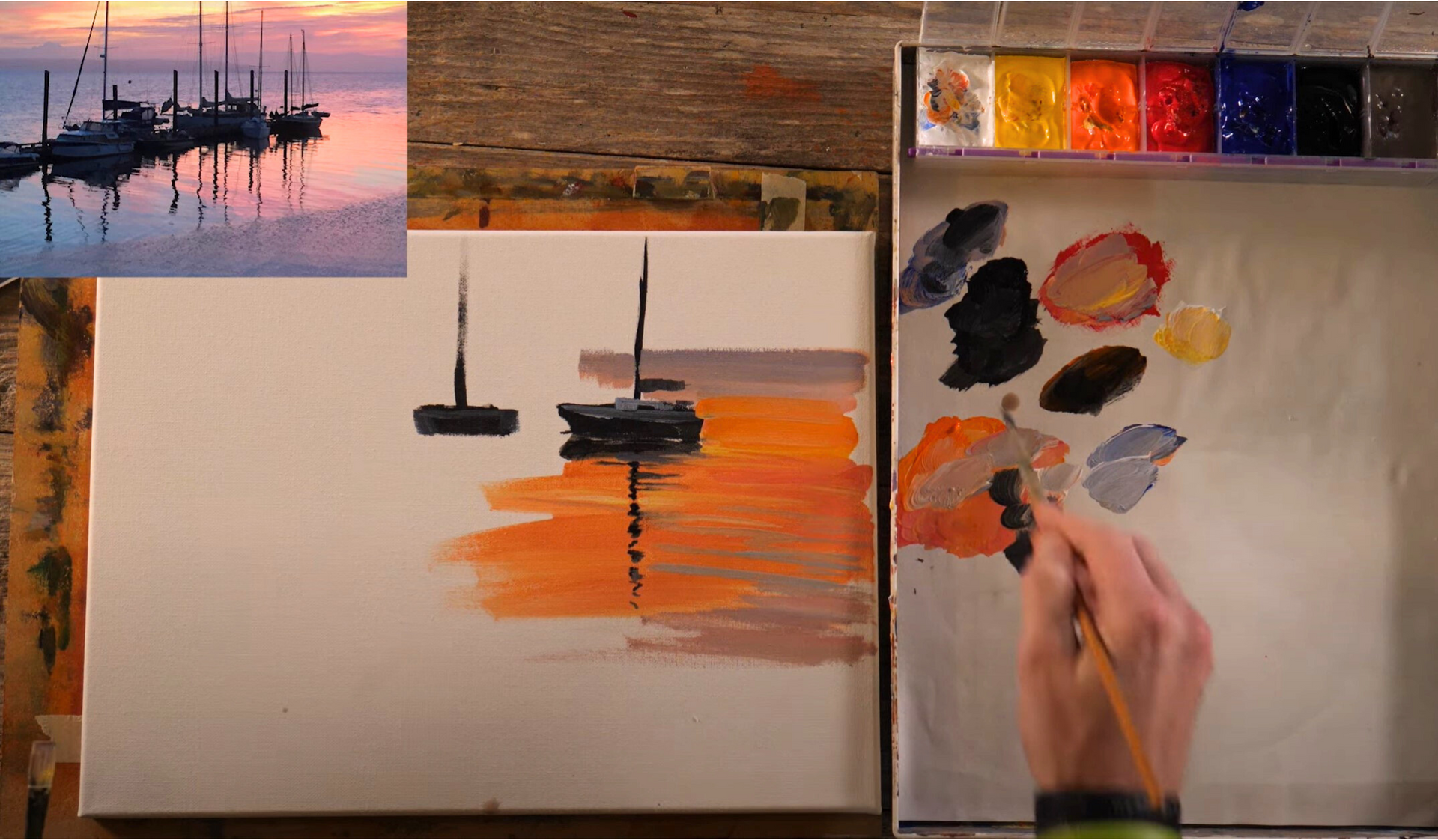
Remember, while painting reflections, observe your reference carefully. The goal is not to create a perfect mirror image but to capture the essence of the reflection in the water. Little squiggly lines, slight color variations, and the broken edges of your reflection all contribute to the feeling of a believable water surface.
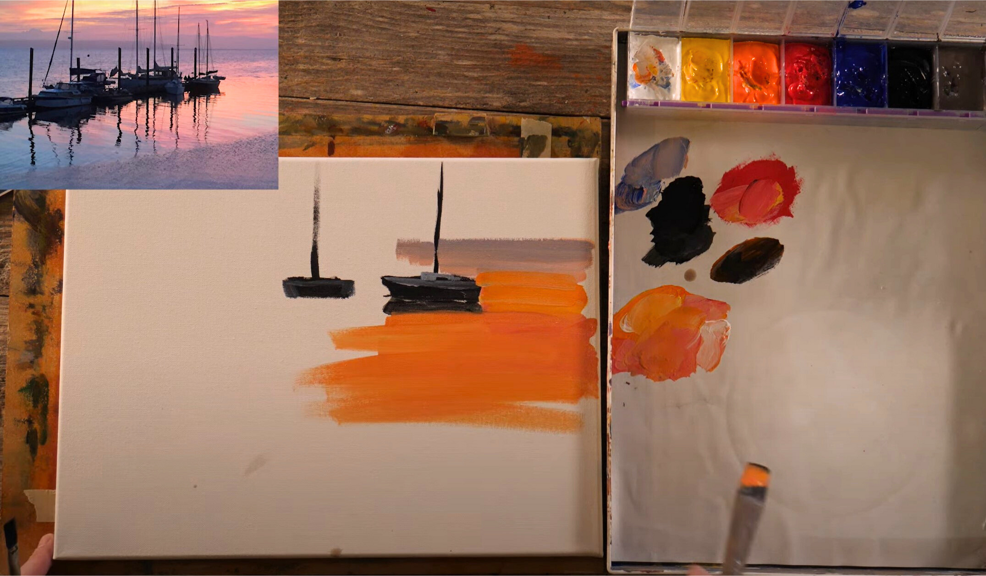
Creating Gradations
The next technique we’re going to practice is adding gradations to our water bodies. This technique works well when painting larger bodies of water or streams, especially those receding into the distance towards the horizon line.
On a clear, sunny day, the water often appears deeper and darker at the bottom of your field of view, gradually becoming lighter as it nears the horizon. This effect is due to the water reflecting the sky: where the sky is darker and the water is deeper, the water appears darker. As it approaches the horizon, the water reflects more light and thus appears lighter.
Here's how to recreate this gradation effect:
- Mix your colors: Start by preparing two distinct piles of paint: one for the darker water at the bottom of your scene and one for the lighter water near the horizon.
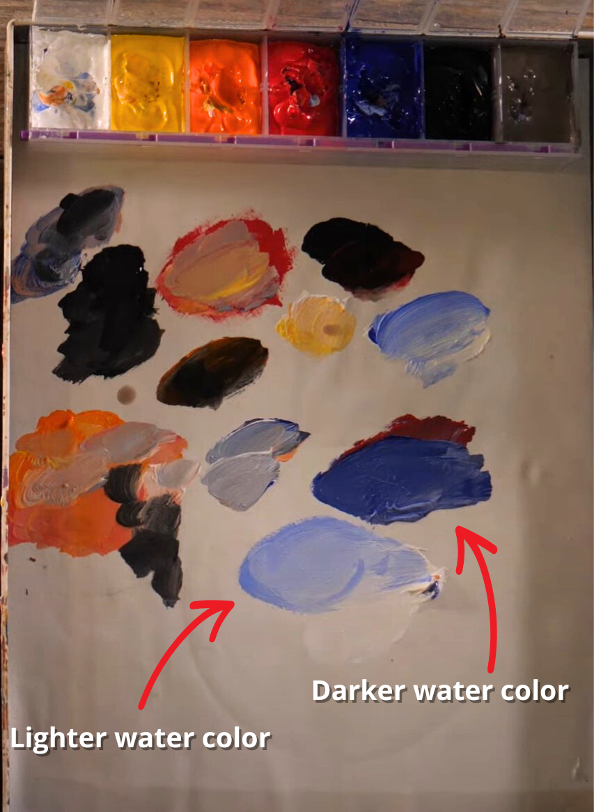
- Start painting: Begin by painting the deeper water at the bottom of your scene. Gradually add the lighter color as you work your way up towards the horizon, blending as you go to create a smooth transition.
- Blend the colors: Continue to blend the two colors, adding more of the lighter color as you ascend. This will create a smooth gradation from the deeper color at the bottom to the lighter color at the top, effectively conveying the flatness of the water and the changing light.
The key to nailing this technique is speed – you need to blend your colors while they're still wet on the canvas. Also, always keep in mind the light source in your scene and how it would interact with the water surface.
By mastering these two techniques – creating reflections and gradations – you can significantly enhance the realism and depth in your water-themed paintings.
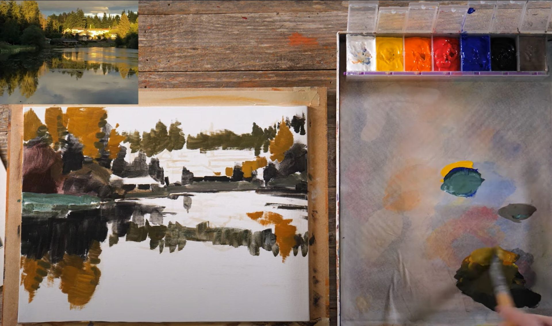
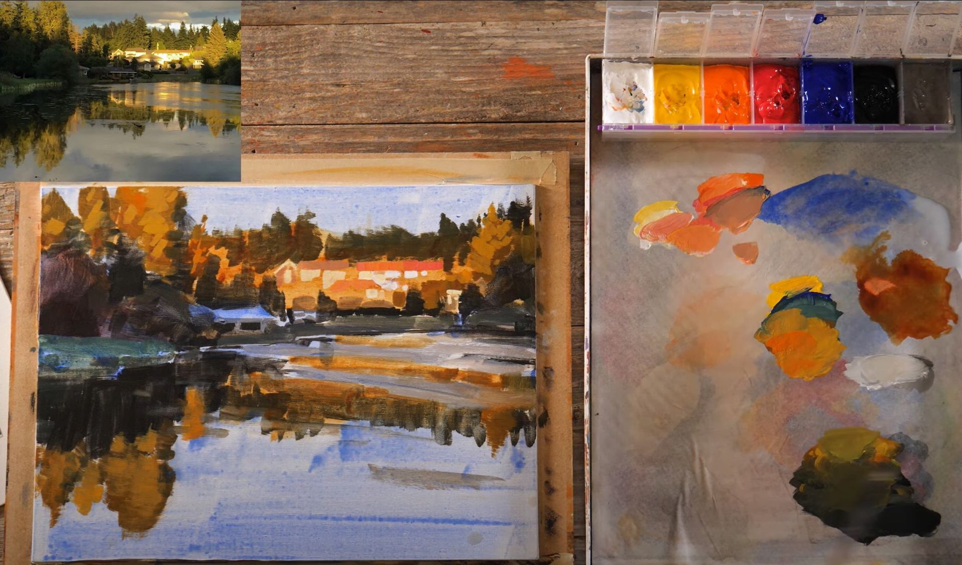
Water Practice Painting #2 - Calm, Reflective Water
This particular scene I'm about to share with you holds a special place in my heart. It was a picturesque moment I stumbled upon last summer while driving near our neighborhood lake. The sun, positioned behind me, cast a radiant glow upon the houses across the lake, creating a breathtaking reflection on the water's surface. Instantly captivated by the beauty, I parked my car and snapped a photo with my phone, knowing it would make an excellent subject for a painting lesson.
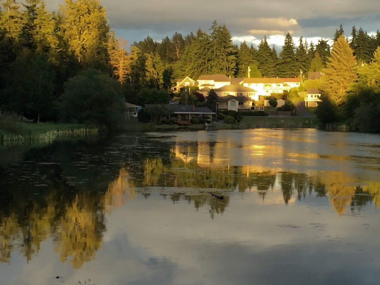
This painting offers us familiar and new challenges when it comes to painting water. This particular image portrays a serene, calm body of water, with intermittent ripples and patches of debris and algae. These unique elements provide us with an exciting chance to expand our understanding and technique when it comes to capturing the essence of water in our paintings.
I hope you find joy and inspiration in this project. Water, as a subject, is vast and diverse, offering endless possibilities for artistic exploration. This lesson will be a little more challenging because instead of copying a scene that’s already interpreted for us, we’ll have to do the interpreting ourselves. I encourage you to embrace the journey, experiment, and have fun. Remember that, I also face challenges and strive to do my best, just like you.
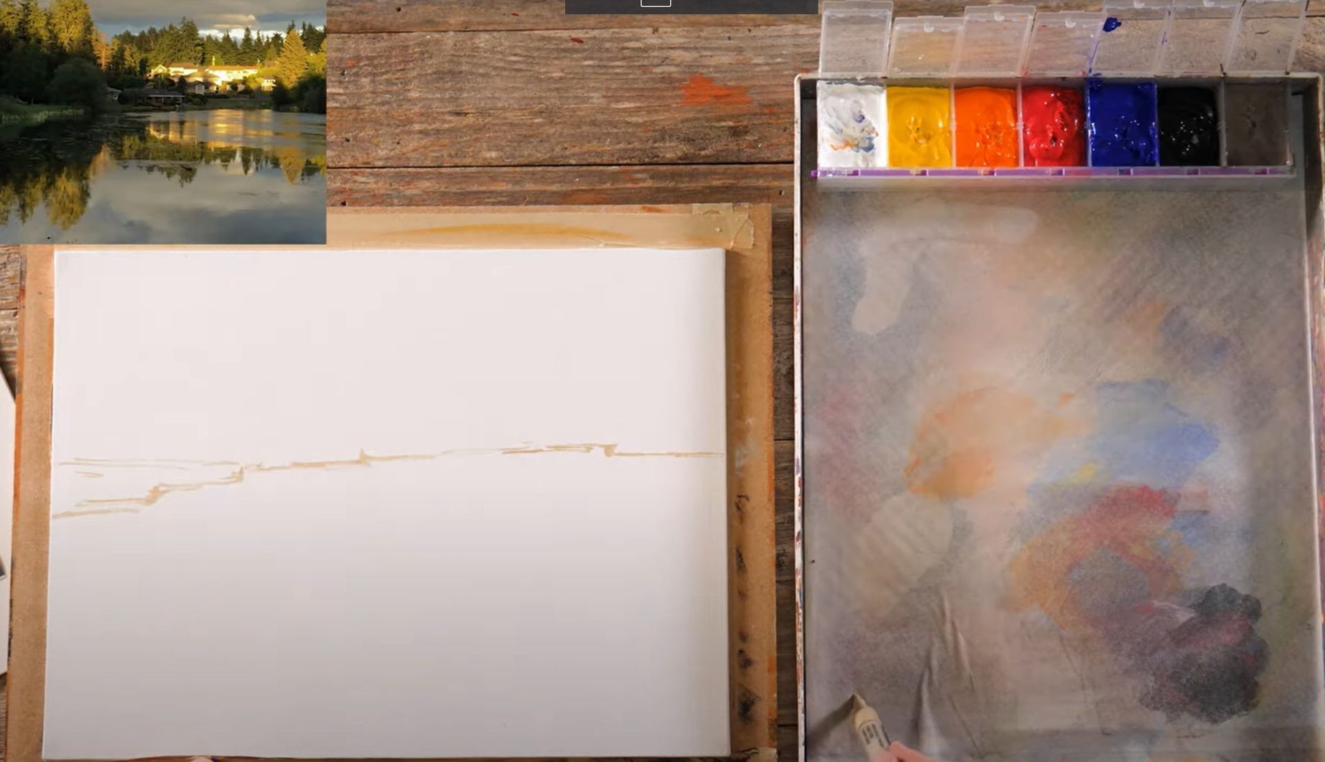
Planning
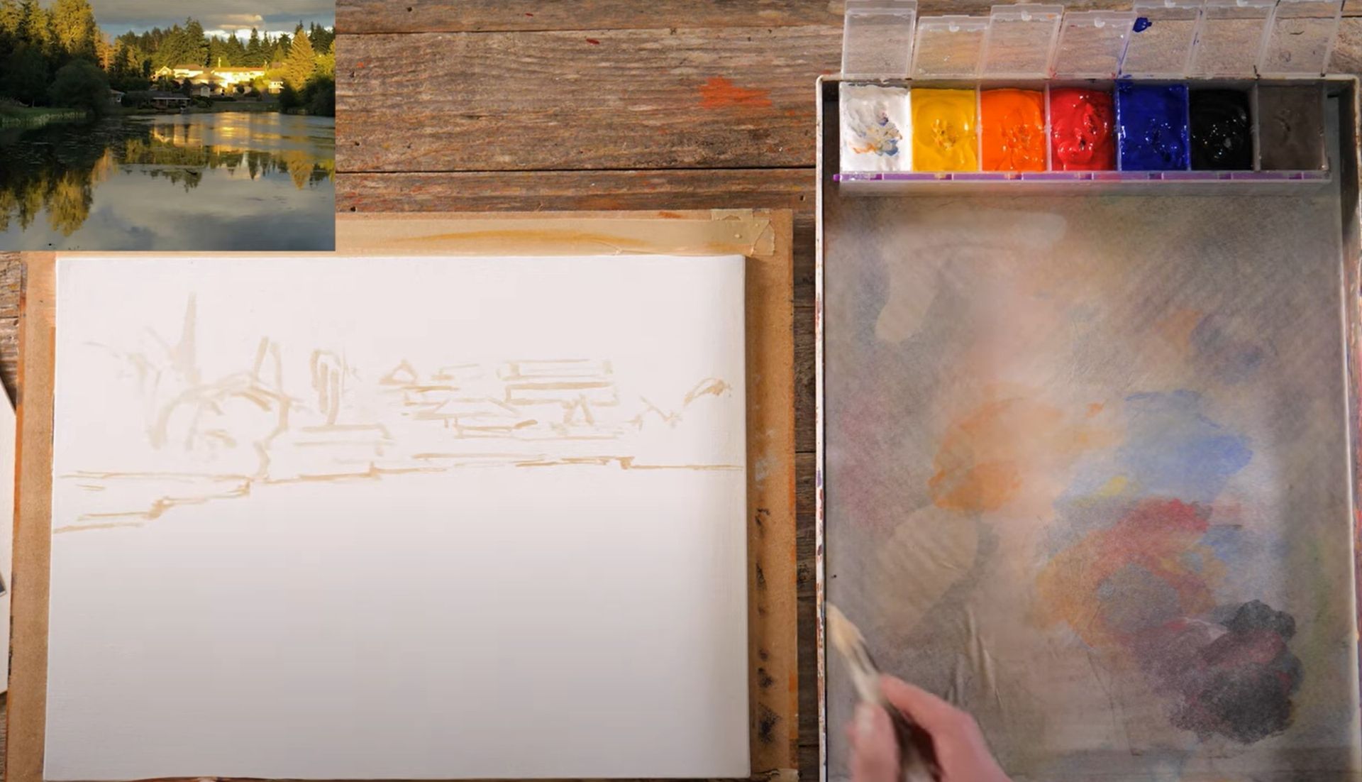
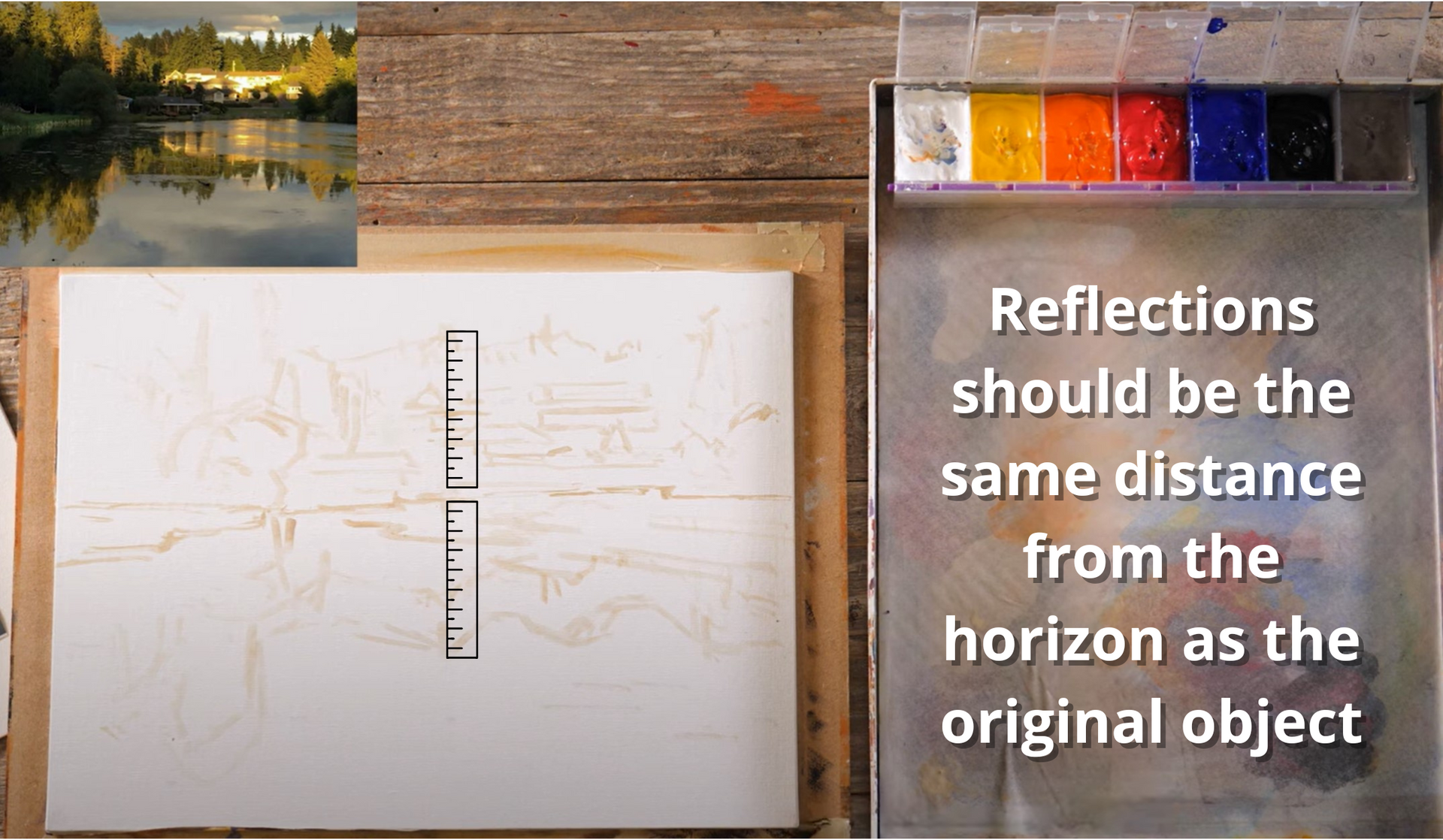
To begin, let's use a paint pen to mark the areas where we'll be working on. The horizon line rests slightly above the halfway point, with the highest point of the water on the right side of the canvas. It extends quite far and gradually steps downward as we move to the left. Furthermore, there's a patch of grass protruding into the water.
As we proceed, keep in mind that the play of light and shadow is crucial here. The unique lighting conditions during the moment I captured the photograph allowed the sunlight to break through the clouds, casting a remarkable interplay of light and shadow on the treetops while leaving the bottom parts in darkness. Take your time with the drawing phase, and don't worry too much about the houses' details. Initially, I contemplated excluding them altogether since our focus is on the water. However, their white appearance, accentuated by the sunlight, adds a fascinating touch. Nevertheless, feel free to substitute them with trees or other elements if you prefer, as it might simplify the composition.
Another thing to keep in mind is that reflections possess a symmetrical quality. Thus, it's crucial to align the reflections beneath trees and other objects accordingly. Reflective symmetry enhances the overall visual harmony. If needed, take extra care to ensure your reflections are properly aligned. It's preferable to take your time with this step than have the elements appear misaligned later. Our brains tend to notice such discrepancies, making the painting feel off even if we can’t place a finger on why.
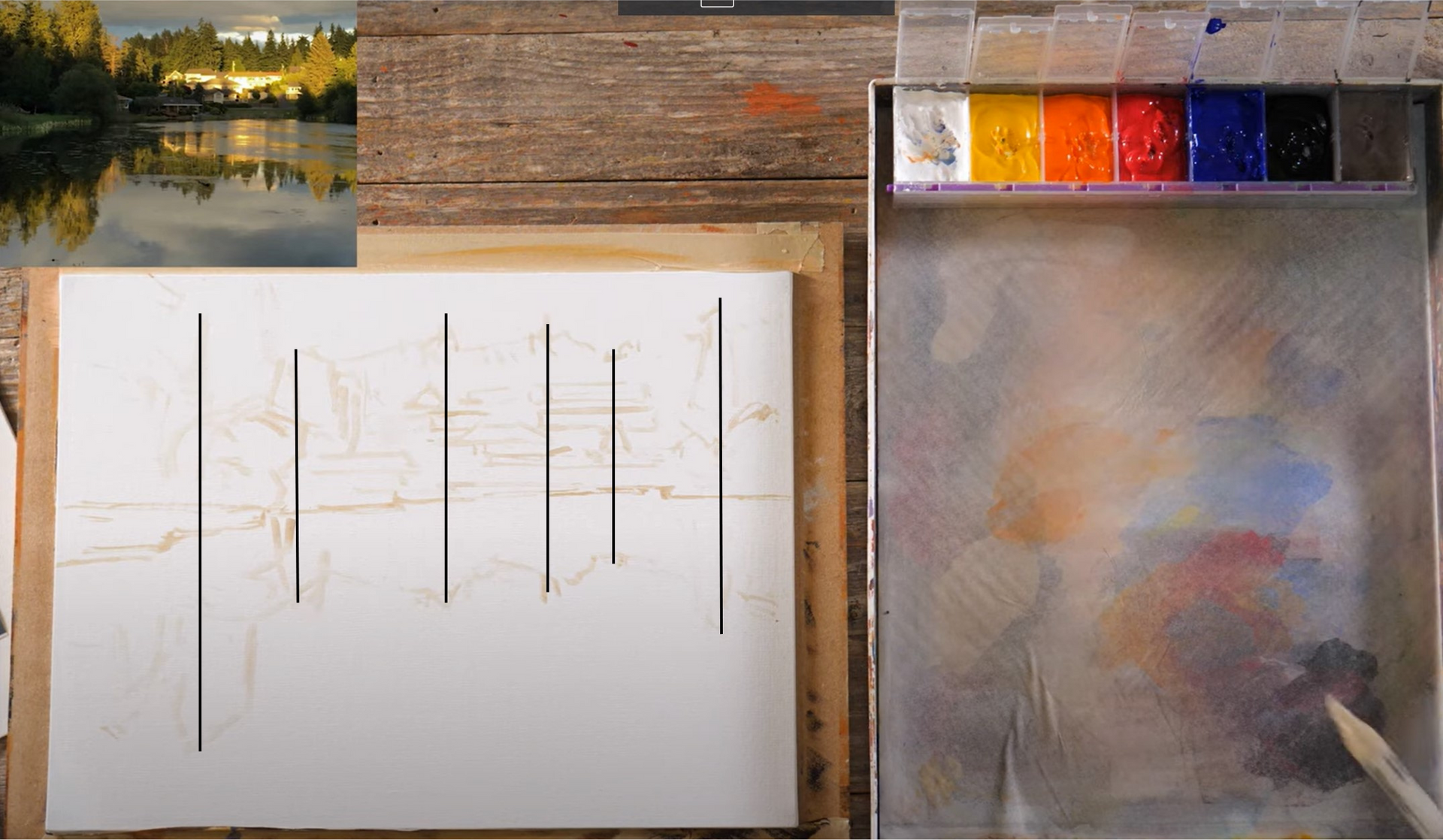
The last aspect of planning this scene that I'd like to draw your attention to is the importance of maintaining consistent distance for the reflections. Since I captured the photograph while standing close to the water's edge, the reflection's distance is proportional throughout. Therefore, it's necessary to extend the reflection of the tree, for example, all the way down, allowing ample space for other elements to be incorporated. Not all reflections will be highly defined. Some will be more subtle. Remember to observe these subtleties in your own observations and adapt accordingly.
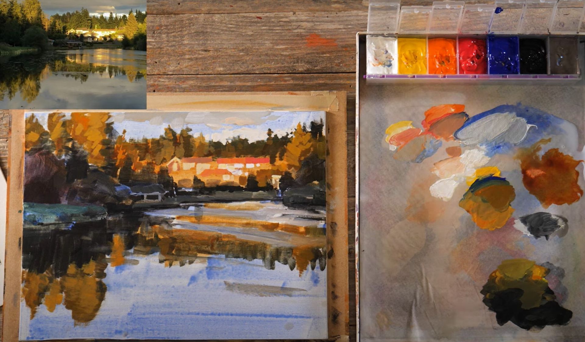
Establishing Darks
Now, as we progress, I'll begin filling in areas with darker tones, using a slightly larger brush. The specific color at this stage isn't as crucial as the values we are striving to capture. In this painting, the values are intense, with the reflections appearing darker than the objects above. The reflections in the water below seem almost black, emphasizing the contrast. Pay close attention to this observation and adjust your colors accordingly. This process is what allows us to refine our understanding of values and capture the essence of the scene.
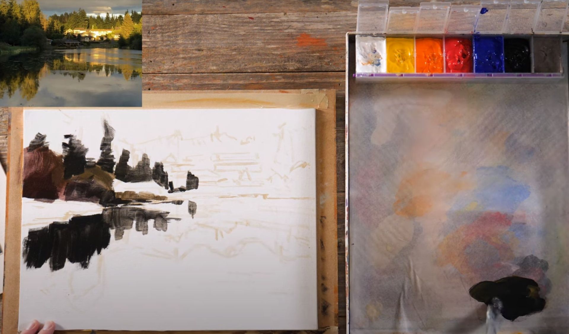
One of my talented artist friends from Indiana suggested the idea of connecting a dark path from one edge of the painting to the other. By doing so, the painting gains a unifying element, enhancing its overall design and cohesiveness. This suggestion profoundly impacted my artistic journey and reminded me that it’s important to keep learning from other artists.
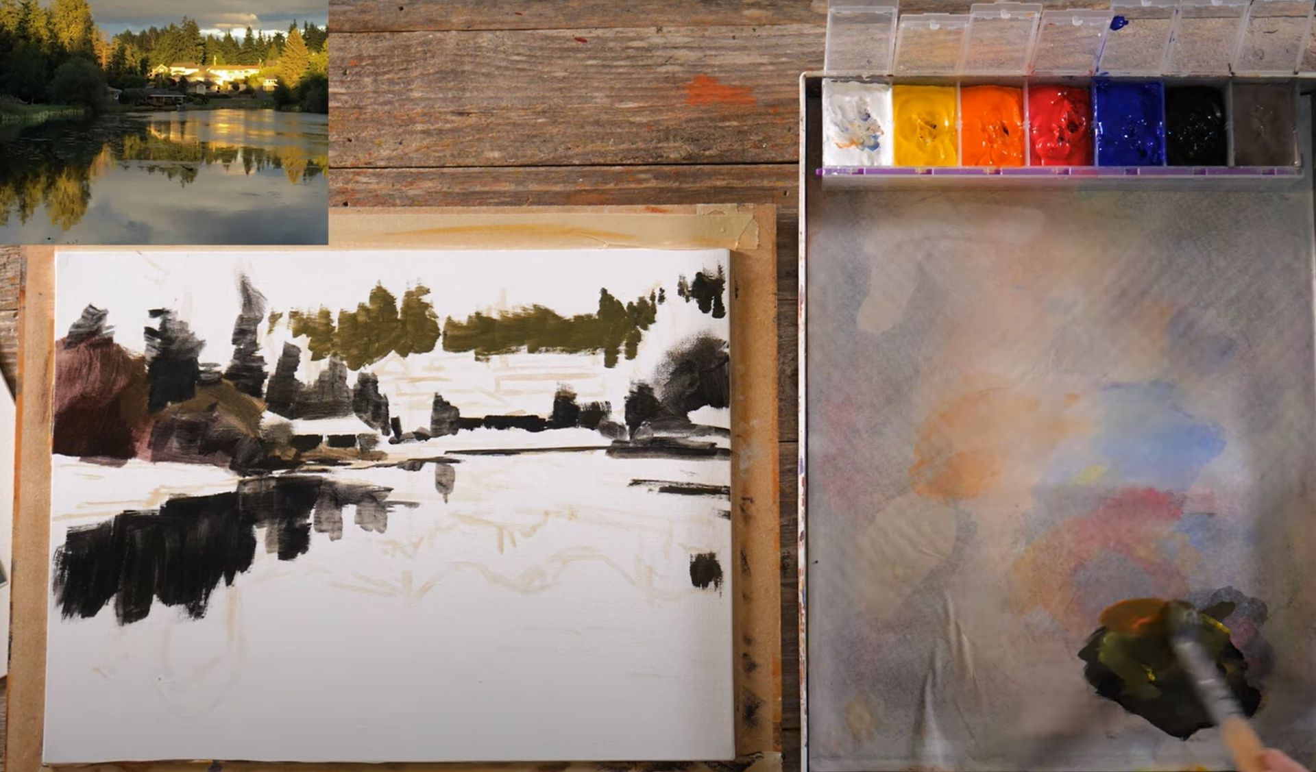
There's an interesting interplay of colors and values happening throughout the composition. As I work, I'll introduce a bit of yellow, transforming the dark hue into a greenish tone. Although much of this initial layer will be covered in subsequent steps, it's beneficial to establish a foundation aligned with the overall color scheme. As you progress, feel free to make adjustments or introduce your own variations to suit your artistic vision.
As we progress, remember that artistry is a perpetual quest. There will always be something new to learn, discover, and refine. Harley Brown, an artist I greatly admire, eloquently described this journey as one that keeps us forever youthful, as perpetual students. The challenges and constant opportunities for growth infuse our artistic endeavors with vitality. We are companions on this creative journey, learning and evolving at different paces. Ultimately, it's not solely about the final artwork but rather the shared experiences, growth, and joy we find in the process.
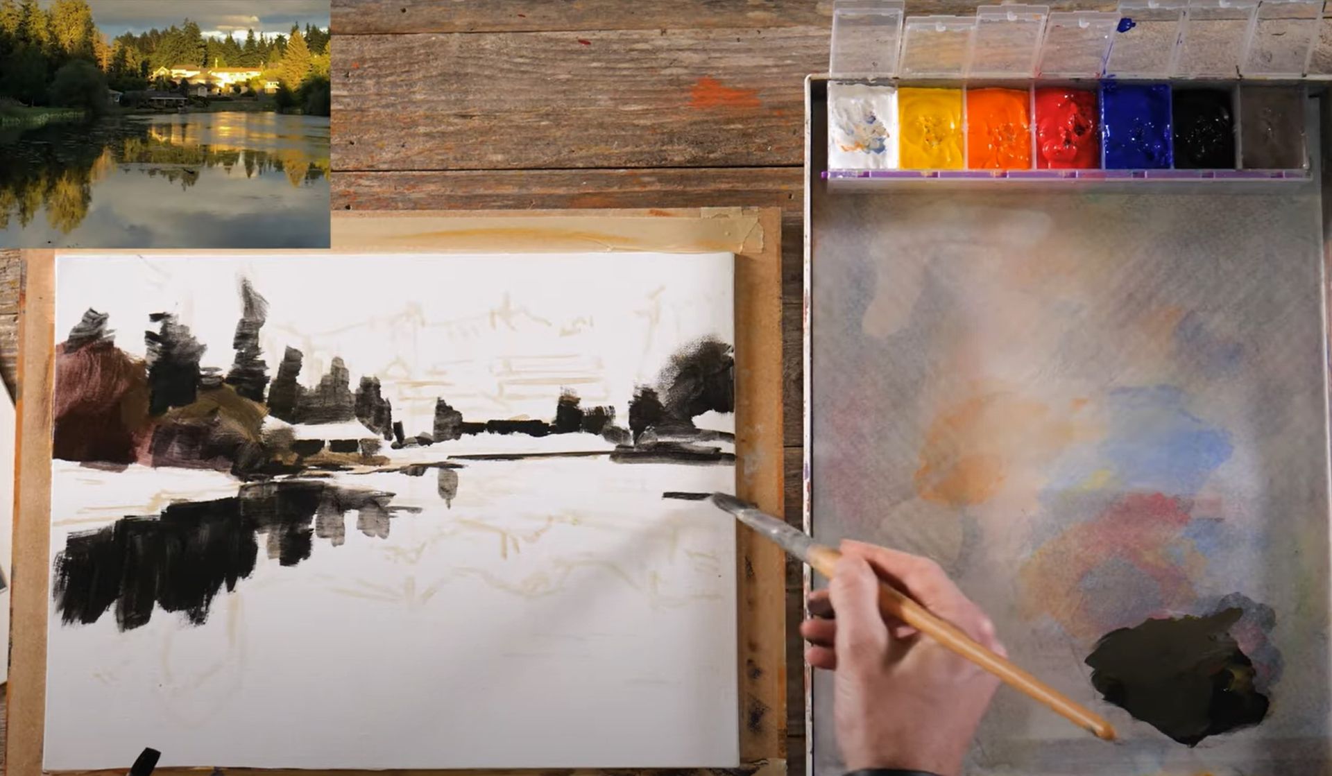
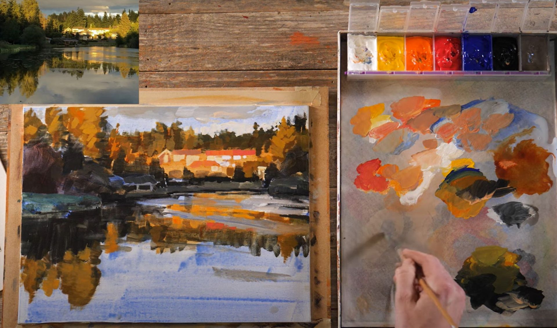
Blocking In
Now, let's resume our painting session by filling in more areas with color. Gradually, we will refine our composition, paying attention to values and incorporating the various elements that make this scene so captivating.
Feel free to explore at your own pace and in your own style. My main mission is to help you understand the underlying concepts and techniques.
Let's continue by introducing some ripple effects into our water scene. I’m going to use grey to portray the disturbed parts of the water like so. This won't be too detailed - think of it as scratching on a bit of texture. While I am working through this swiftly, feel free to spend more time on it. Sometimes, less is more - so don't worry if you make a mark that feels too big. Here’s what my painting looks like after adding some of those grey ripples:
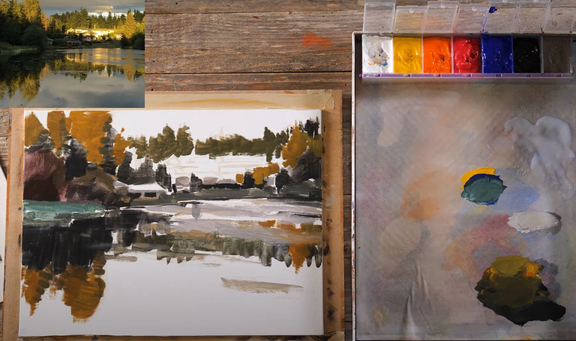
The next step in our process is to add a wash or glaze over our painting. This helps to establish a harmonious color balance. I'll be using a cool ultramarine blue for the upper sections of the sky and clouds, and a warm quinacridone gold for the middle area where the sun is most vibrant. This approach of using contrasting colors will highlight the cooler and warmer areas of our scene. After applying the wash, take a moment to dry your painting thoroughly before proceeding.
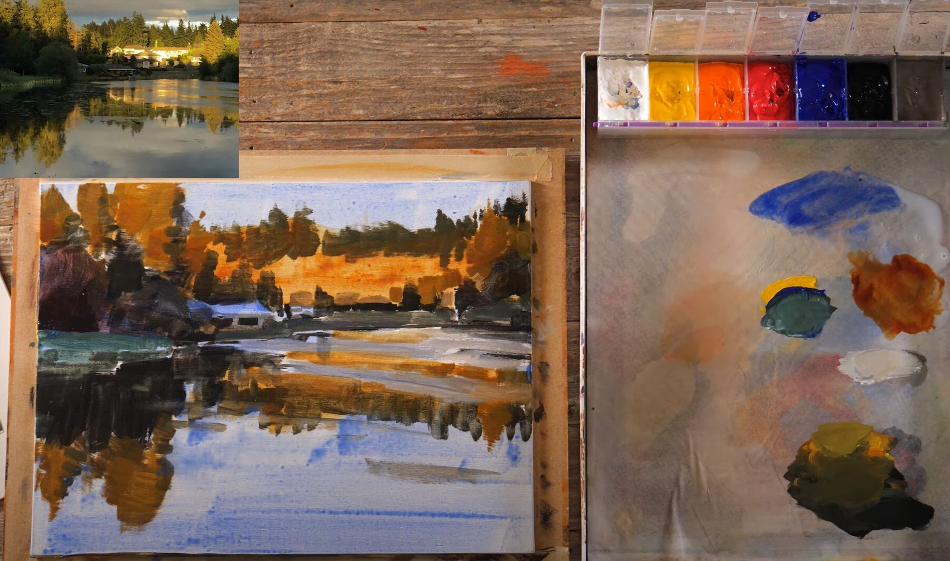
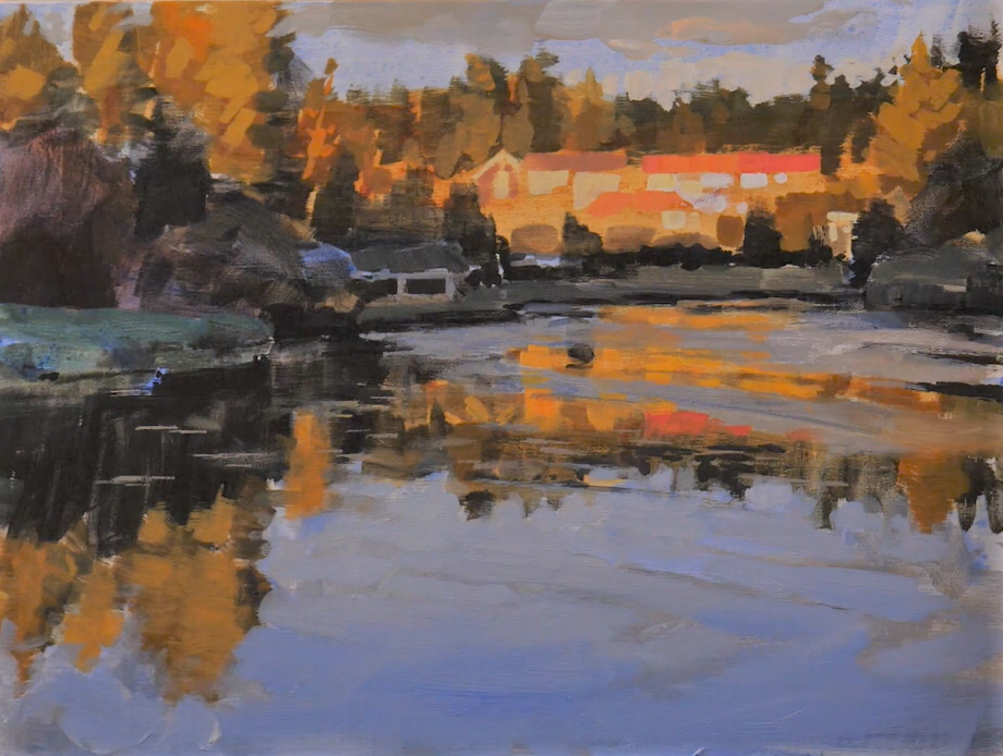
Refine
As we move on to refine the details, we'll start from the top down. The idea here is to capture the warmth and color in the trees, then mirror that in the reflection on the water. While capturing reflections, aim for a slightly blurred or softened appearance to distinguish it from the actual object. Don't stress about getting every detail in there; sometimes, a more abstract approach can convey the essence more effectively.
When painting buildings or other architectural elements, you can use warmer shades for rooftops and lighter tones for walls, creating an impression of the warm, late-afternoon sun. Here again, aim for an abstract representation that communicates the essence of the scene.
The final steps before moving onto the water and reflections below is to define the edge where the land meets the water and to add some opaque color into the sky to represent clouds. The edge of the water is generally quite dark due to shadowing. Creating this contrast can further enhance the realism of your painting. With the clouds, we want to imbue a warm glow. This process may result in trimming a bit off the trees, and that's okay. Let a tiny bit of the sky's blue peek through, and don't shy away from introducing a lighter hue in the background for added intrigue.
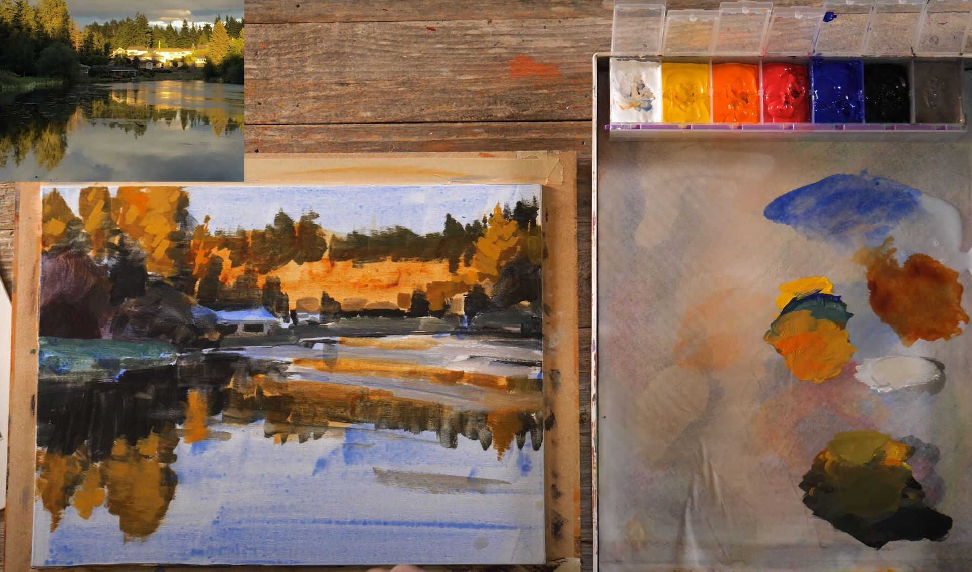
Let's work with a color slightly darker and richer than the white above for the reflection of the houses. This hue should be somewhat orange and stretch across in vertical streaks. The reflection isn't a pure mirror image, but rather an abstraction. Some parts, especially those with ripples or other disturbances, might not show the reflection clearly. By maintaining the line and reflections on either side of it, we can suggest the presence of water.
As we finish off this painting, grab your sky color and use it as your main water color. Mix more blue and white into some areas for variation. Aim for soft edges and subtlety; you don't want to be heavy-handed with your brushwork. Using the sky color will not only create color harmony within the painting, it will also create believable reflections.
All of these small details will start to weave together, giving your painting a convincing water-like appearance. Even at this rough stage, you'll begin to discern the reflections.

Now, observe how we have different feels going on; the warm reflected light from the houses creates vibrant and strong reflections on the still water and the bluer areas exhibits the rippled reflections. There's always more you can do in a painting, but as you progress, you should be able to capture the feel of your scene.
The last steps would be to brighten the areas of the strongest light and incorporate more of these into your composition. Your painting journey is all about capturing the essence and creating a visual narrative that speaks to you.
This painting endeavor is an exciting journey, a fun experiment of creating your own masterpiece. Now, it's your turn to put these insights into practice. Keep perfecting your art, and we'll explore more in the next lesson. Thanks for joining, and I look forward to seeing you again.
Start Painting For FREE: