What I learned about Painting Mountains from Edgar Payne
Would you like to learn more about painting mountains? I sure do, so I'm going straight to the work of master artist, Edgar Payne, to see what I can learn! I hope you come along with me in this step by step Acrylic painting tutorial, as I delve into the alpine beauty of one of his awesome pieces of art!
“The mountains are calling and I must go.” John Muir wrote these words years ago, but the phrase still sums up the feelings lots of us have about the majesty and awe of mountains. Mountains beckon to us and invite us in for an adventure. Maybe more than ever, we want to escape to them and enjoy all they have to offer us in the great outdoors. For us artists, mountains offer a wealth of inspiration and painting material. That’s why I’m excited you’re here today as we learn how to paint mountains step-by-step, together!
Materials
I'm using a 12x16 canvas. You can use a smaller canvas if you want, like 9x12. I would recommend keeping the 3:4 ratio the same if possible (11x14 would be a different ratio). If not, you will need to adjust the proportions of the design to fit your canvas.
Paint colors:
- Titanium White
- Cadmium Yellow Light
- Cadmium Orange
- Quinacridone Red (PV19)
- Ultramarine Blue
- Mars Black
- Neutral Grey
- Phthalo Blue
Design
First, let’s get started on design.
We’re going to be focusing on painting a master copy of Edgar Payne’s Sierra Mountains. Before we start, I want to give you a tip. If you are referencing a scene from a photograph, experiment with different designs! You could use Photoshop. You could print a photo and remarket it. Or you could fill a page of your sketchbook with different thumbnail designs; remember- you are the boss of your composition and ultimately of your painting! If an element from your reference photo detracts from the overall composition, simply take it out. Once you get the bones of your painting laid down, you’ll find it takes out lots of later guesswork during the painting process!
In fact, Edgar Payne, the artist we’ll be learning about later, was commonly known to do this! For instance, when Payne was starting a design concept to develop into a future painting, he would add and subtract from his sketches until he was happy with the composition. This is probably the most important, albeit underrated, step in the painting process. So remember, be patient. The time you spend on this now will be rewarded later!
Perspective
Okay, now let’s talk about perspective. Mountains are massive! Observe how mountains and their colors and values change as they move farther away from us. If you begin to study mountain paintings, you’ll notice that the colors are warmer and more saturated on foreground objects. Closer objects are darker in value that those in the distance. And if there are layers of mountains moving into the distance, you will see that the farther they recede, the lighter they become. Employing this natural phenomenon called atmospheric veiling is a vital part of creating depth and dimension in our mountain paintings.
Brushstroke
Another important aspect to keep in mind as you paint are your brush strokes! When painting mountains in acrylic, we have ample opportunities to create texture and angles with our brushwork that will capture the natural ruggedness of mountains and mountain ranges. Thoughtfully place these brushstrokes, use them wisely. Whether you are painting plain rocks or rocks covered in snow, think about the direction your brushstrokes are moving; horizontal, vertical, at an angle, etc. and vary them accordingly.
Before we move on to painting mountains step-by-step, let me introduce you to one of my favorite artists, Edgar Payne, the painter of the stunning piece we are focusing on today.
Edgar Payne was born in the heart of the Ozarks, near Cassville MI, in 1883. He formally started his art career by enrolling at the Art Institute of Chicago, to study portrait art, but he didn’t stay. Two weeks after enrolling, Payne departed, finding the Institute too structured for his liking. Payne trusted his natural sense of artistic direction, relying on teaching himself and practicing lots. He transitioned into landscapes and worked his way to California at the age of 26. Payne spent several months painting the gorgeous coastline around Laguna Beach (where he would later have his studio and home; and help start the Laguna Beach Art Association and become its first president). Payne then went up to San Francisco, where he met his future wife, commercial artist Elsie Palmer. The next year Payne visited the Sierra Nevada Mountains for the first time. This was a turning point in his career. He would return many times to paint the untouched Sierras; these paintings are some of the most recognizable of his fantastic work.

So with that inspiration, let’s jump right in and find out what materials we’ll need to get started!
Starting Out

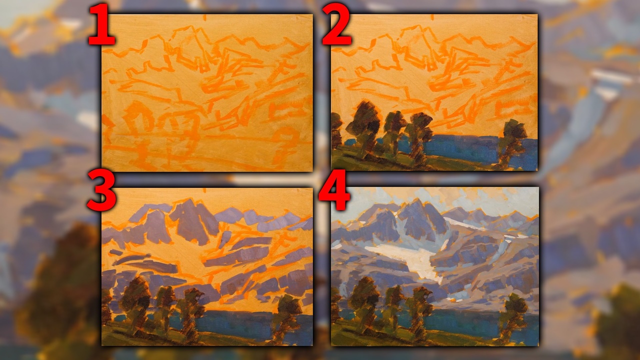
I use paint for getting the initial design on the canvas. Feel free to use paint markers or even a pencil if you are more comfortable with that. There is a lot of detail in this painting so try not to get “hung up” on all those details when sketching. My main goal of this step was to make sure the large snowy area and the main peak were roughly in the right place. (Keep in mind that if you use pencil, it may show up in the final painting. If you don’t mind that, then go for it!)
For this painting, I decided to tone my canvas with Yellow Oxide. It is a warm, neutral yellow. I choose it because, when observing Payne’s painting, it looked like he might have started with a warm under-painting. You can use any warm color that you like!

The next step is blocking in the trees and water. If the viewer were standing in the painting, they’d be pretty close to the mountain, so we’re going to be using dark, saturated values. We’ll come back later and add more highlights. A base of Phthalo blue was great for getting the rich blue/greens of the mountain lake. You can see that there’s even a bit of lighter purple tones on the background. Just try to continue to match the colors as well as you can, and more importantly, the values.

Now it’s time to paint the mountains! In this painting, we have both rocks and snow; lights and darks. We’ll start by blocking in the dark shadows on the craggy rocks. I mixed some blue, Quinacridone Red, orange, and even some grey to achieve the variations we see in Payne’s piece. The highlights are just a lighter version of the mixture. Then go and add a little more detail… some more nuances in the ridges, crevices, clefts, etc. Keep in mind, part of how we show distance is by making values lighter as they recede. Small, subtle changes make a big difference in how we view the end piece. And while our version of Payne’s painting will probably look quite different, the goal is to be as close to his masterpiece as we can. We can learn so much from studying how the masters used composition and values!

We are on the homeward stretch! Start bringing in the snow shadows, using a cool blue color. There’s quite a few crevices to fill, all the way from the distant peak, down to where the mountain meets the lake. Now, add some more white to your cool blue mixture to make a cleaner snow color. Just pay attention to the shapes and bring it down from the peaks. I used a heavier, dry brush technique, and ended up using just plain white, with a bit of the underpainting showing through.
Good job for making it this far! The main design, values, and colors are all blocked in now. All that we have left to do is to paint the sky then finish with some final refining of the piece. If you’re feeling discourage or frustrated as you complete this painting, try reframing your “mistakes” as happy accidents” (Bob Ross). Many of your “mistakes” can add richness to your painting as colors and brushstrokes are layered on top of one another. This has been the case for me many, many times.
Here, let’s look back at the original and try to see some of the design nuances. In this step, I simply added some more brush work, using a cool blue tone that’s darker than the snow highlights, but lighter than the shadows. This gives additional depth and dimension.

Congratulations, we’re now on the last step, the sky! Take a look at how Payne did his sky. See the clouds? They’re not as bright as the snow- they actually look a little dirty. We can learn from that! If they were bright white, they would compete with the snow on the mountains, and would throw the whole composition off. For the clouds, I mixed up a lighter version of my under-painting, with a bit of the blue mixture to tone it down and painted them loosely in. From here, we’ll go on to the surrounding sky. Mix up a light blue with Phthalo and White (like the snow shadows we already did). You can also shape the mountains with your sky. I then made my blue mixture a bit darker and added it to some of the mountain peaks. I did this because it helped make the mountains recede into the distance, strengthening the allusion of depth and making the perspective more pleasing to the viewer. Remember, blue tones remain the strongest over long distances, and reds and yellows fade away. That’s why even trees on a distant mountain appear blue, not the bright greens and other colors that you would see in trees that are close up. Keeping that in mind, I used darker values on the closest crags, even adding some red tones.
Finally, paint some dark shadows onto the foreground grasses. Now, add some highlights to the nearby trees. I mixed Phthalo blue with yellow for the highlights on these trees. Adding these details into the foreground trees also helps to push the mountain further back in the painting, creating the ever important sense of dimension and scale. Reiterating what we covered earlier, using vibrant colors in the foreground which contrast with the cooler muted background, is vital for developing your painting’s sense of perspective. Use a bit of negative painting in the water to help shape the trees. And finally, bring in some of the lighter-purple hues, reflected in the water.
Conclusion
There you have it! I really enjoyed painting this master copy from one of my favorite artists, Edgar Payne, and I hope you did too. There was a lot of adjusting of values and colors. I hope that didn’t bog you down too much.


When I look at our paintings side by side, I see so many differences. For example, my painting turned out much warmer than his, but that’s okay. I was learning and trying. That’s good enough for me! What have you learned from doing this step-by-step mountain painting? I hope that you learned something new or gained some further understanding of painting mountain scenes!
And to recap, always remember to spend the necessary time in the initial stages of the painting process by working out your composition until you’re pleased with it! Then block in the different segments of your painting using correct color temperature and values. They are your allies for creating depth and dimension. Finally, save the details for last- they’re the icing on the cake!
I hope this study brought some of the grandeur we call mountains into your world today! Happy painting!
As always, I would love to see your rendition from this master copy, so please share if you can! And if you share on your personal social media, remember to use hashtags #jeddorseyart and #acrylicuniversity. And give Mr. Payne credit for the original painting! Thanks for joining me and I hope to see you creating!
Do you have a problem with keeping your Acrylic Paints wet? Are you new to Acrylic painting? If so, you need to check out this article on the amazing paint box and sta-wet palette for Acrylic painters.